Behind the Art:
Creating 'Where's Babu?'
Leiturinha, 2025
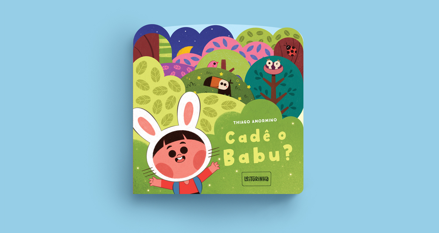
Where’s Babu? is an interactive board book created for very young children (ages 0 to 3), designed to introduce emotions in a playful and accessible way. The project was developed on a tight deadline — around 30 days — and I had complete creative freedom to develop the story, characters, visual identity, and book design, while respecting the technical limitations of printing and finishing. Being responsible for nearly every creative aspect kept me in constant motion, and it turned out to be a project unlike anything I had done before. With the editorial support of the Leiturinha team, I dove headfirst into this universe, which had already begun to take shape from our very first meeting.
Emotions for the early years
Since the story was aimed at very young children (0 to 3 years old), I started by diving into the study of emotions. I wanted to better understand their nuances and think of ways to translate them visually in an intuitive and accessible way. That’s when I came across Plutchik’s Wheel of Emotions, which became an important guide in organizing and choosing the feelings the main character would experience throughout the narrative.
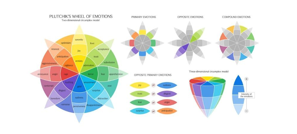
Available at: Six Seconds. https://www.6seconds.org/2025/02/06/plutchik-wheel-emotions/ (accessed on April 25, 2025).
The challenge of structure and simplicity
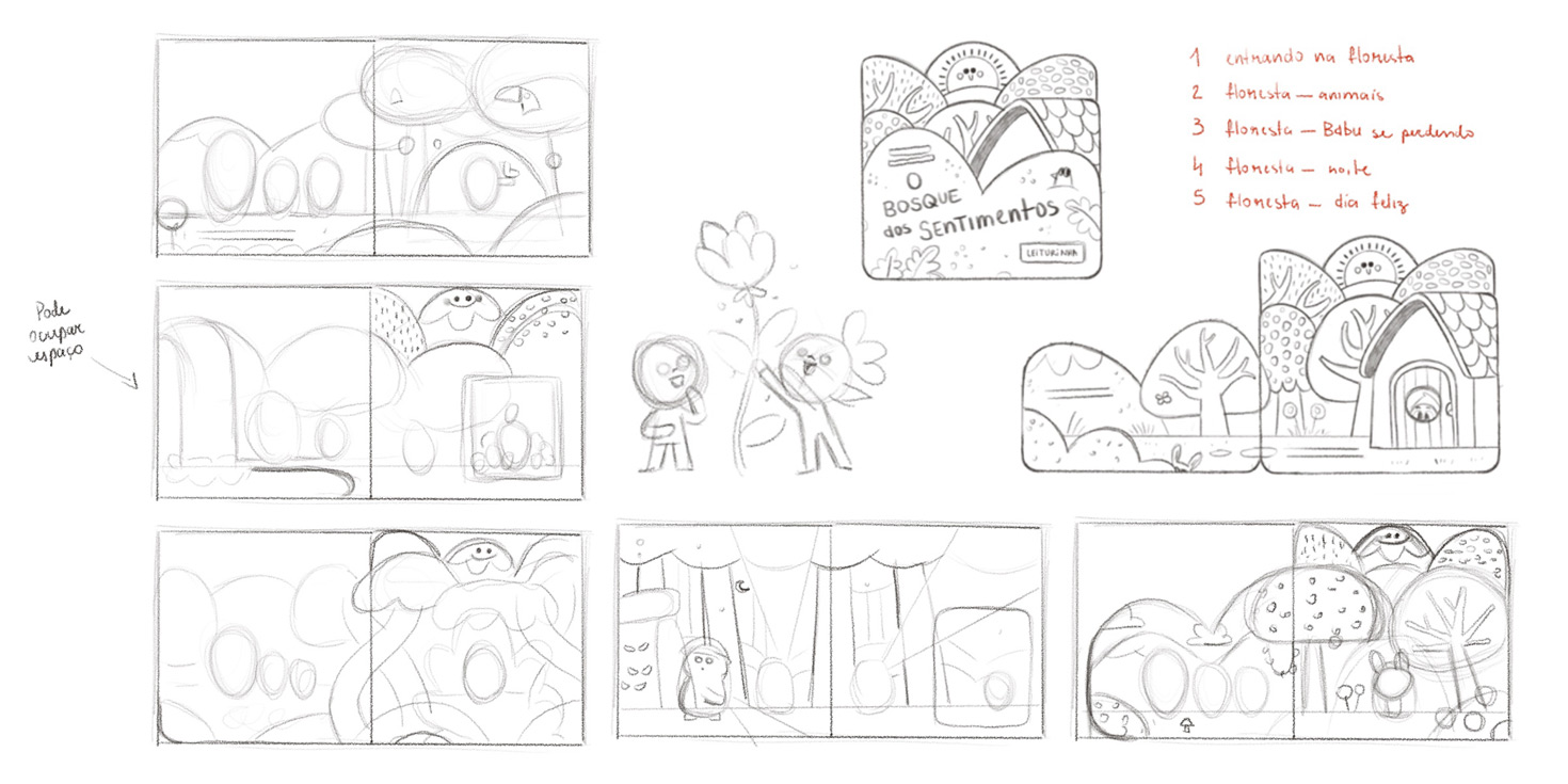
The book needed to have five spreads, which led me to ask: how do you tell a complete story (with a beginning, middle, and end) in just five scenes, while also working with five different emotions and very little text?
So I made a few key decisions:
• The narrative would take place in a magical forest, inspired by the world of 'Winnie the Pooh' (which I love and always find enchanting);
• I wanted cute, expressive characters going through a story of friendship and discovery (like the adventure movies I grew up watching);
• The central idea would revolve around a character who gets separated from his friends and, while being searched for, reveals a different emotion on each page.
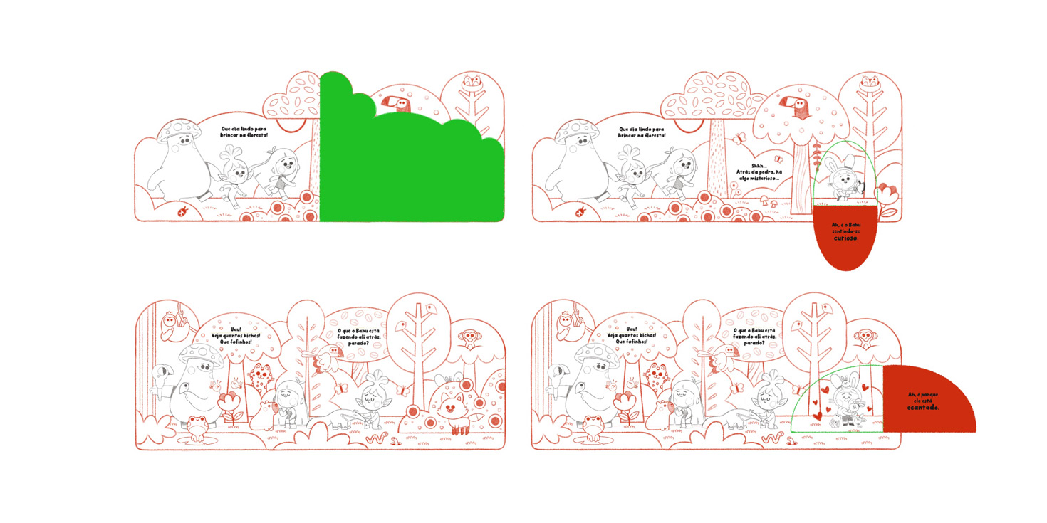
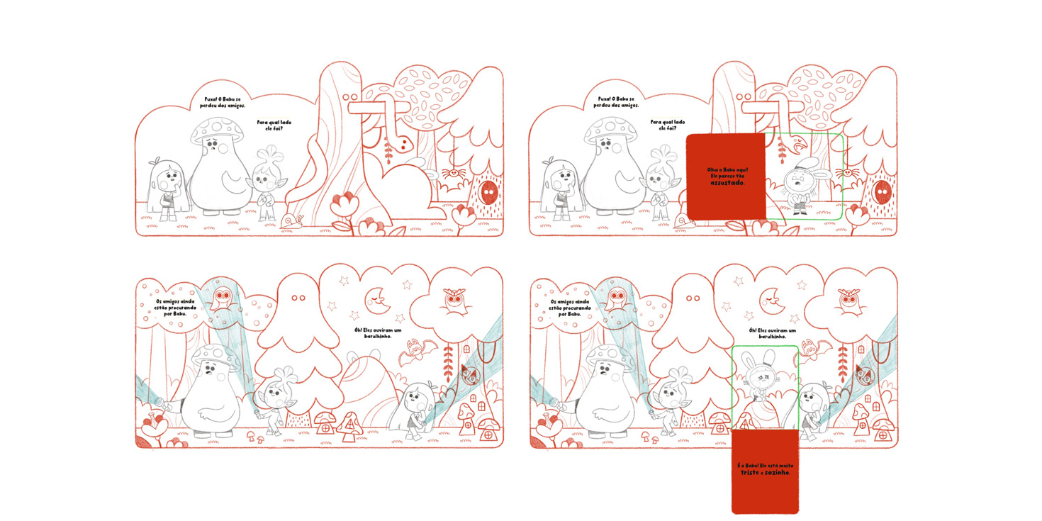
The book’s interactivity — being a lift-the-flap board book — added a powerful element: the character Babu would always be hidden behind a flap, and it would be up to the child, along with the friends in the story, to find him. When lifting the flap, not only would they find him, but they’d also discover what emotion he was feeling in that moment.
A touch of adventure and the Hero’s Journey
To build the plot, I used an adapted version of the Hero’s Journey, which helped me structure the events and emotions across the five spreads. Here’s how the structure turned out:
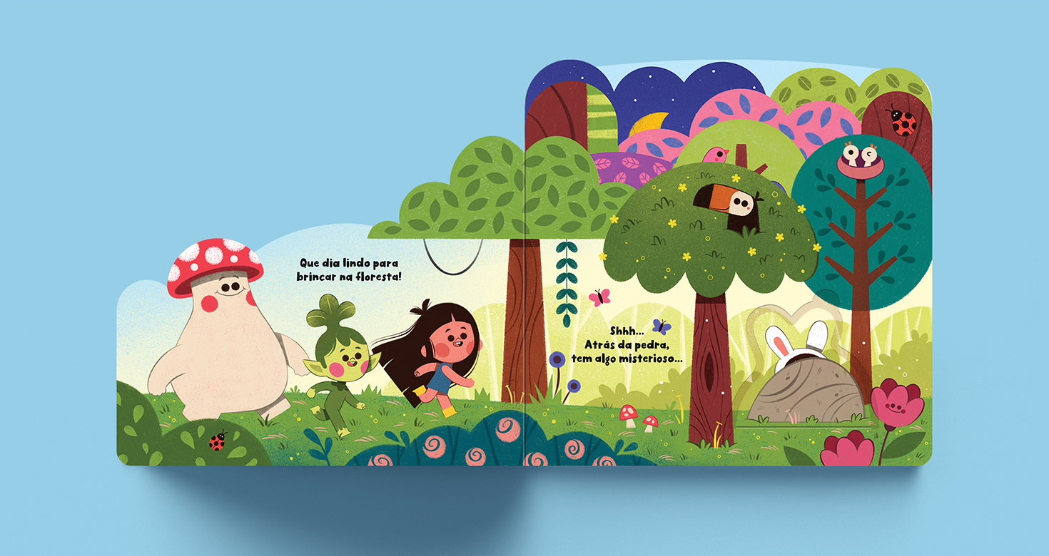
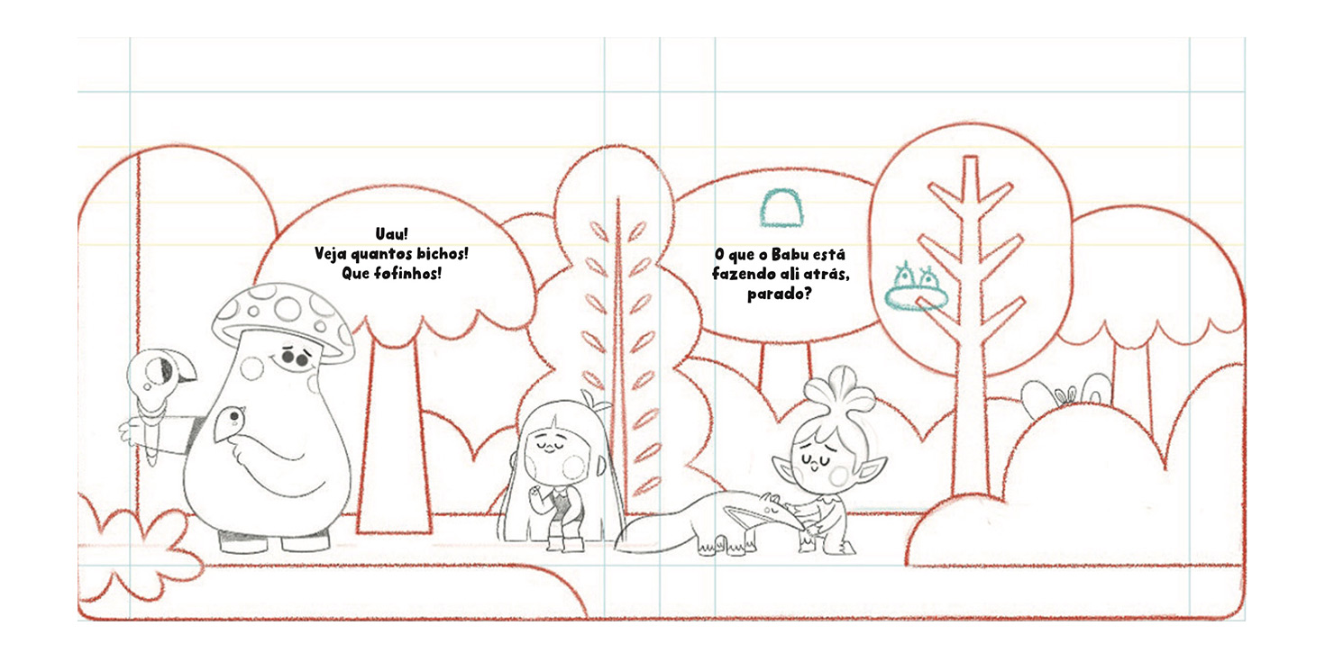
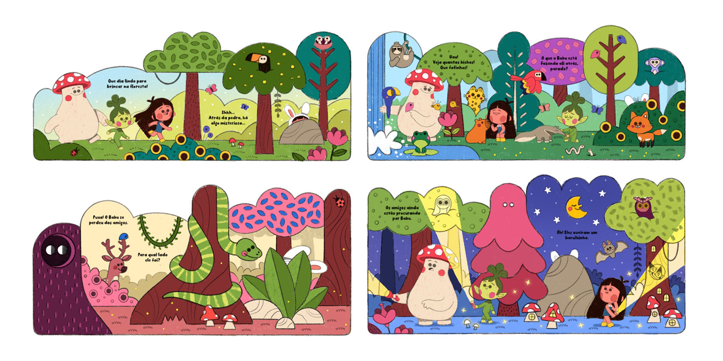
Spread 1 – Babu and his friends playing in the forest – Ordinary World
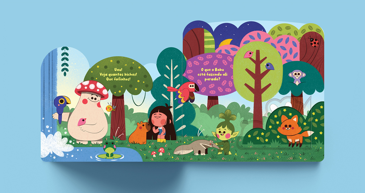
Spread 2 – Babu is captivated by the animals and gets distracted – Call to Adventure
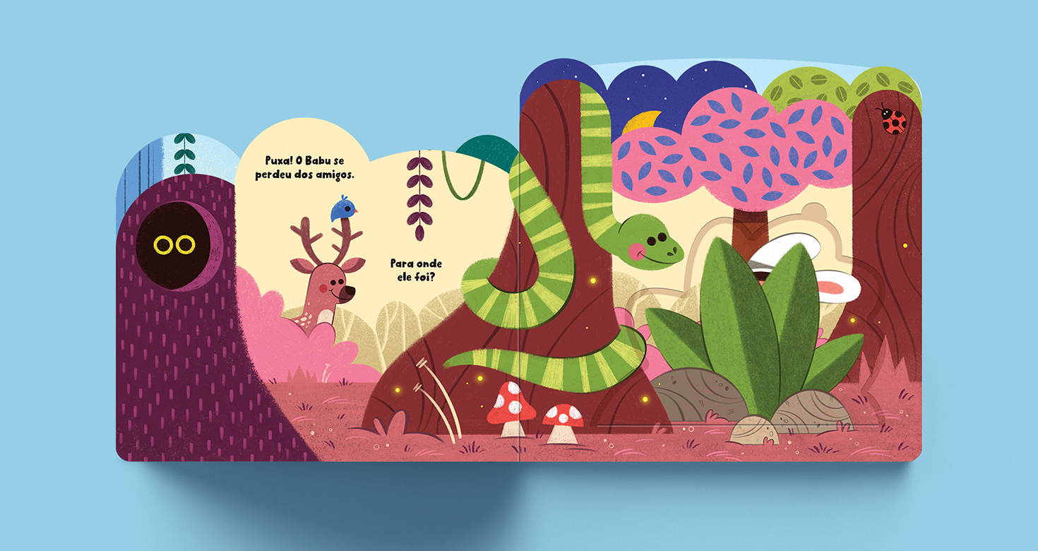
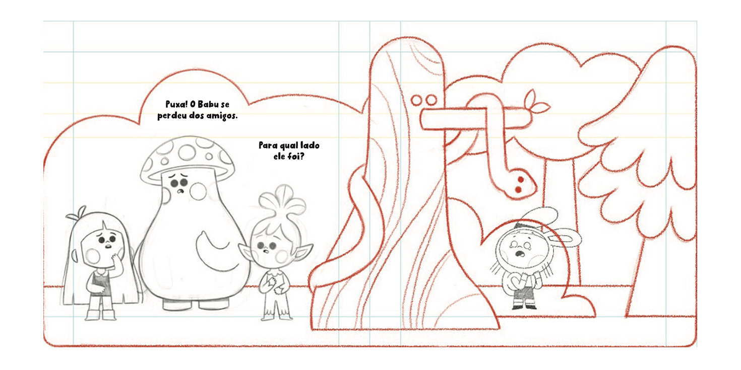
Spread 3 – Babu gets separated from his friends – Conflict
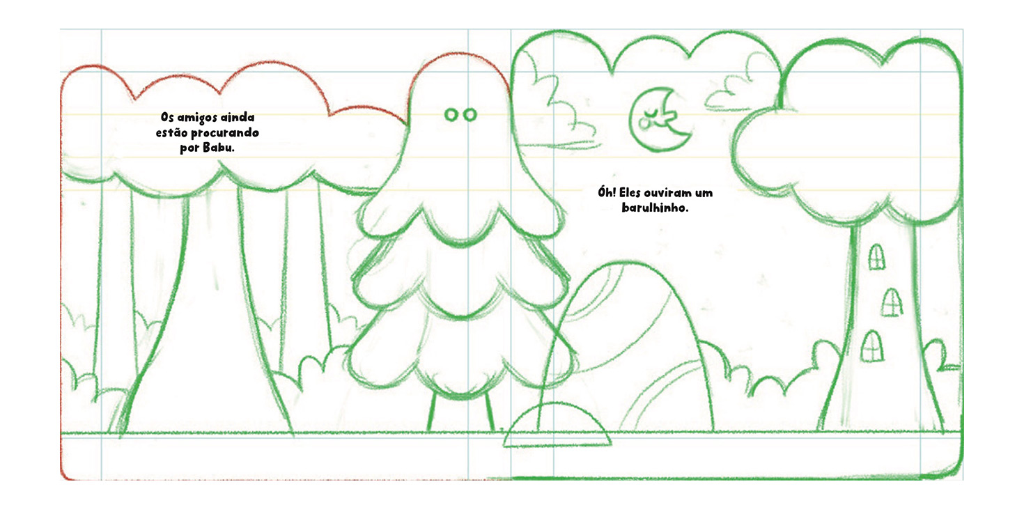
Spread 4 – The friends search for Babu – External Help
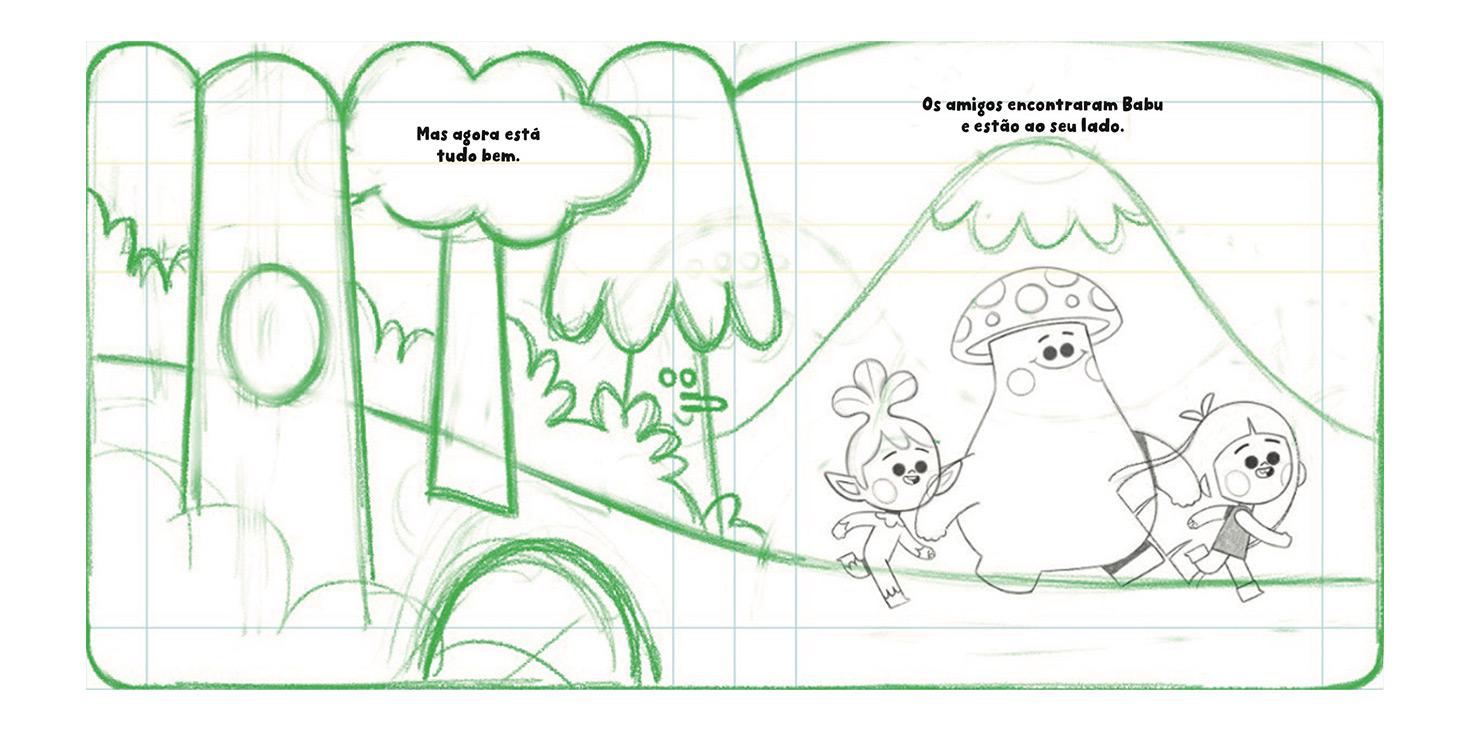
Spread 5 – Babu is found and embraced – Resolution
Building the visual universe
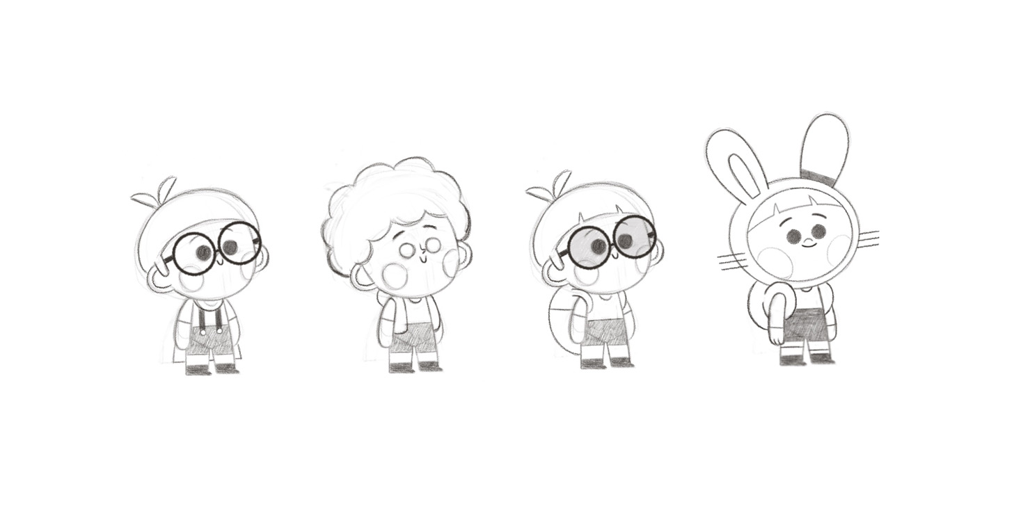
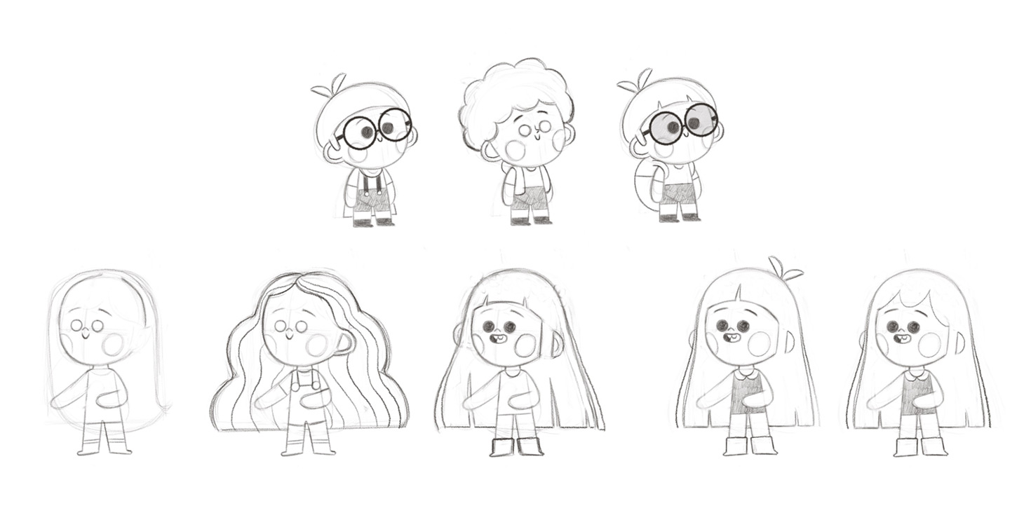
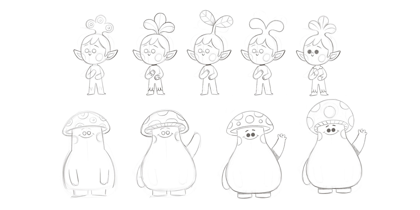
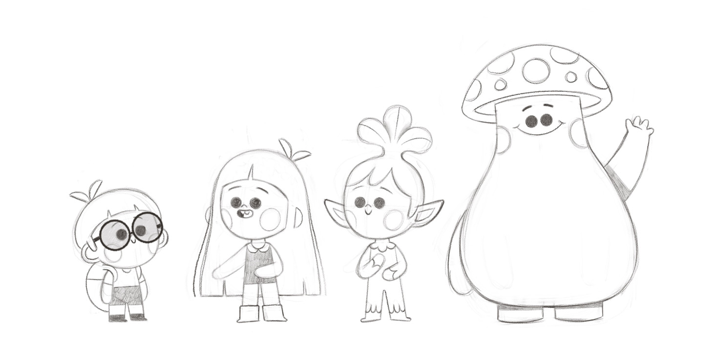
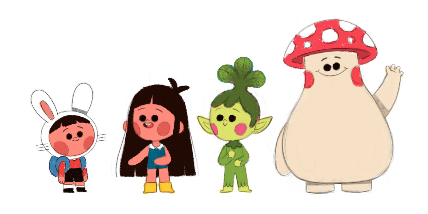
With the script approved, I dove into the character creation phase. They had been “gestating” in my mind throughout the earlier steps, so it didn’t take long to land on the shapes and expressions I was looking for. But the main character, Babu, needed special attention.
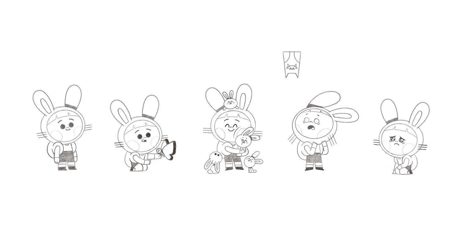
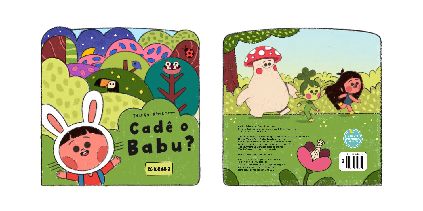
In the first version, he was just an ordinary child. But I felt he needed to stand out — both visually and emotionally. That’s when I thought of 'Max' from 'Where the Wild Things Are' and 'Finn' from 'Adventure Time'. Inspired by them, I designed a bunny-ear hoodie for Babu. It made him cute, unique, and memorable. Problem solved! \o/
Visual interactivity and book design
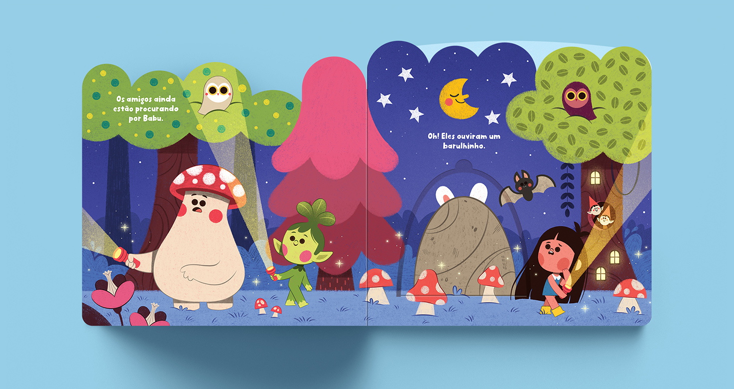
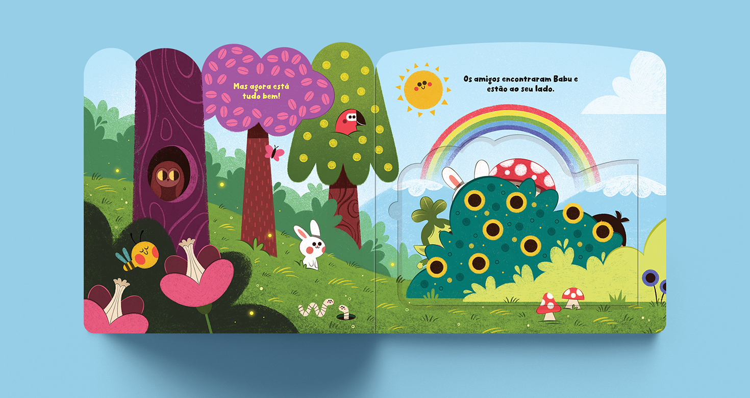
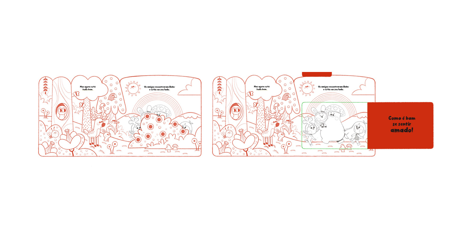
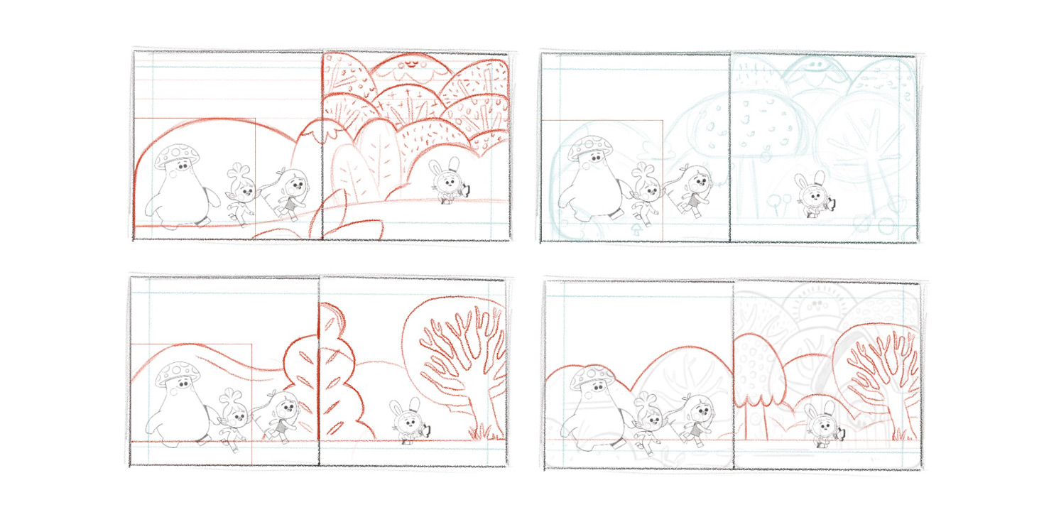
One of the biggest challenges (and joys!) of this project was creating the illustrations while accounting for a unique die-cut shape on each spread. This meant each scene had to have a distinctive format, yet still visually connect with the others, both when the book was open and closed. The design had to be cohesive while also playing with the surprise element of each flap.
Color, emotion, and final touches
The final stage of the project involved choosing the color palette. I always begin by creating a color rough, a general study that defines the base tones before moving on to the final painting. This gives me speed and visual coherence. Still, I stay open to the unexpected — new ideas tend to emerge along the way, and I enjoy embracing those creative surprises.
I also adapted the illustration and painting style to meet the needs of the target age group. Books for very young children often feature flat color images, but I wanted to do that in my own way. I reduced the use of light, shadow, and volume, and opted for colors with textures that evoke childhood art materials (like crayons, oil pastels, and colored pencils) instead of flat tones.
The backgrounds, objects, and characters were drawn with simpler, rounder shapes to support easier visual comprehension. The characters came out super cute, with blushed cheeks, dot eyes, and restrained but expressive facial features — everything crafted to emphasize the sweetness of Babu’s world.
Outcome and distribution
Today, Where’s Babu? is being distributed to over 280,000 subscribers of Leiturinha across Brazil and beyond. It fills me with joy to know that this project, crafted with so much care and intention, is now reaching the hands of so many children and helping them recognize and name their own feelings.
Special thanks
A heartfelt thank-you to the wonderful people who helped bring this project to life.
To Paulo Fuzinelli, who has always been kind to me since our very first contact, years ago.
To Juliana Tomasello, who gently guided and supported me in shaping Babu and his entire universe.
And to everyone at Leiturinha who worked behind the scenes to make this project happen — this result was only possible thanks to your help, dedication, and talent.
With love,
Thiago

Instagram ♥️ © Thiago Amormino 2026
