
Behind the Art:
Creating 'The Girl Who Knew'
Editora Matrescência, 2022
The Girl Who Knew is a picture book published in 2022 by Editora Matrescência, part of the Virtues Collection conceived and written by pediatric nephrologist Luiza Ghizoni. I was responsible for the illustrations and design of all four books in the series, developed over more than a year. Born from the author’s clinical experience, the collection offers comfort to young patients and their families, while also helping the wider public understand the emotional and practical challenges faced by those living with illness, promoting empathy and awareness.
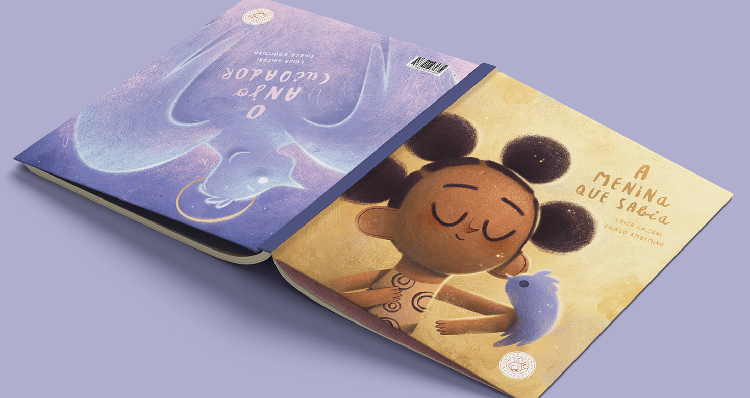
Each book in the series is centered around a specific theme and contains two interwoven stories. One story begins on one side of the book, and the other begins on the opposite side. The narratives meet and merge in the center spread. In The Girl Who Knew, the focus is on childhood cancer and the virtue of faith.
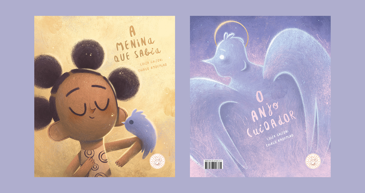
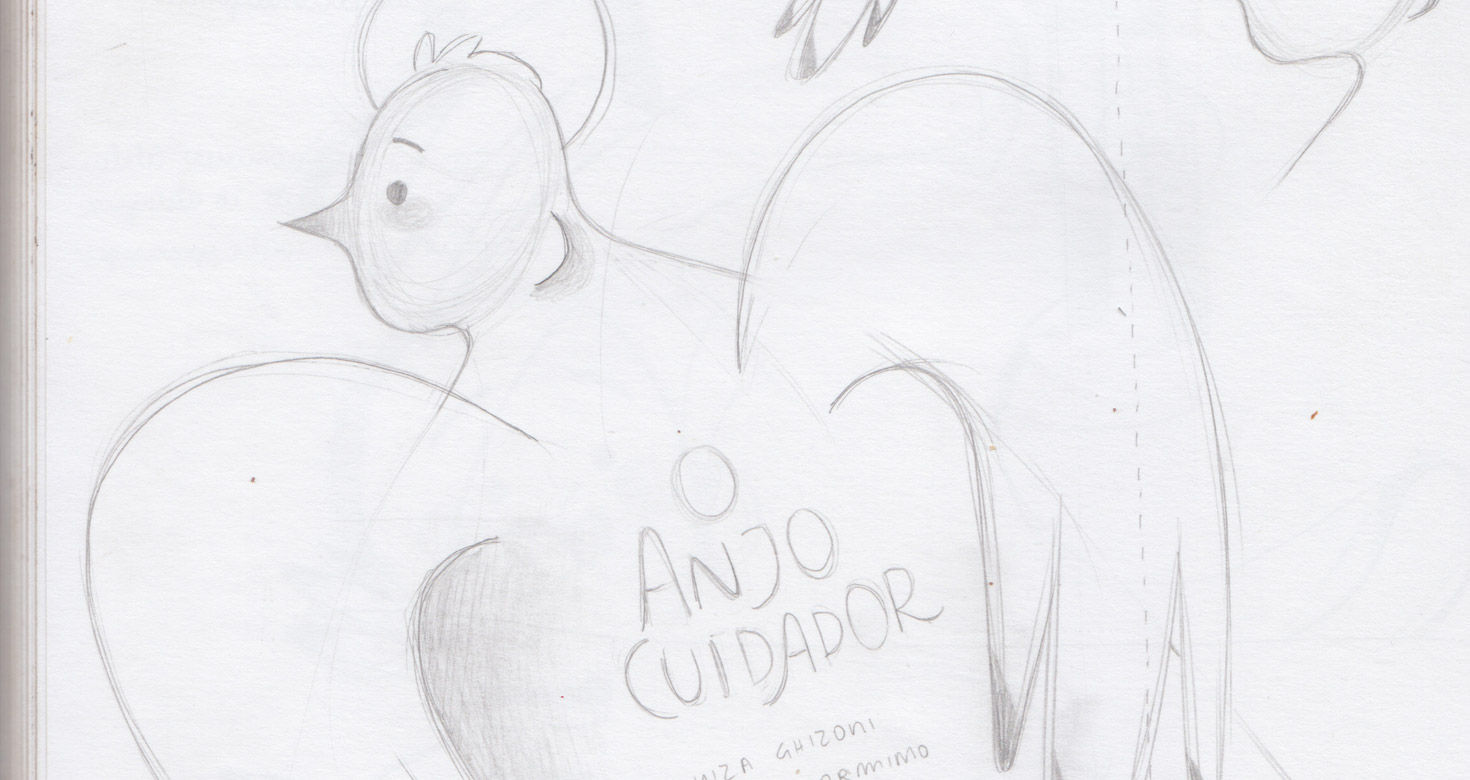
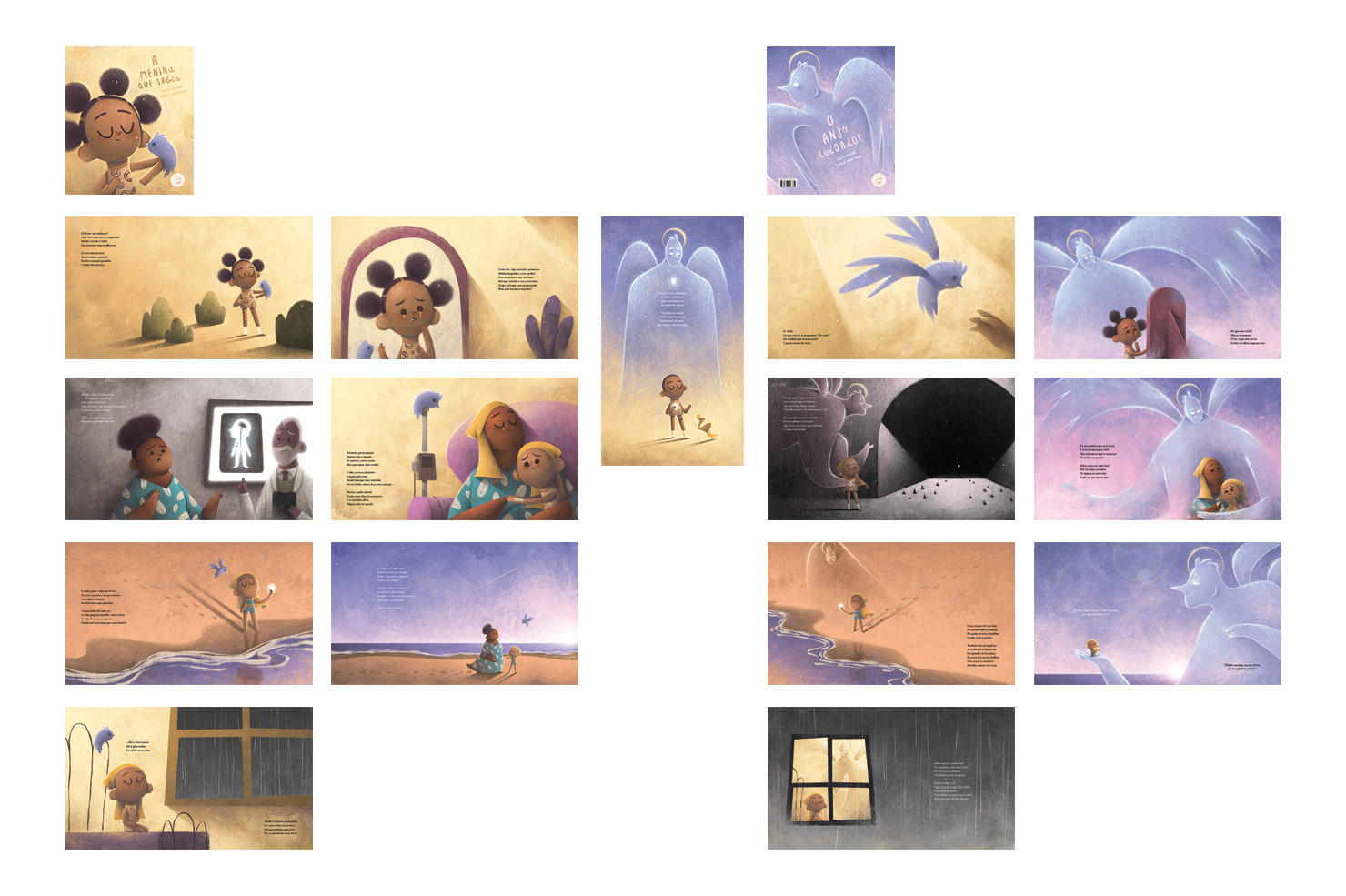
Covers from both sides of the book: The Girl Who Knew and The Caring Angel
Initial challenges
Each book in the collection brought unique creative challenges, but this one was the most emotionally complex. Its theme — childhood cancer — is deeply sensitive. Beyond that, I needed to portray the story with hope and positivity, while visually representing the abstract idea of faith through the image of an angel.
My goal was to balance the pain experienced by the protagonist and her family with a sense of visual comfort and optimism. Of all the books in the series, this one touched me the most. It allowed me to connect with the most delicate and meaningful side of my artistic practice. Even now, I still get emotional when I revisit it, sometimes even during my own difficult moments. The message of hope in the story and illustrations reaches far beyond its central theme, which, to me, shows the strength and emotional power this book carries.
One of my favorite double-page spreads
Narrative structure and visual strategy
The text written by Luiza offers two perspectives on the same moment in time. On one side of the book, we follow the protagonist as she shares her experience with illness, diagnosis, treatment, and all the emotional struggles along the way. On the opposite side, we meet the guardian angel — the "Caring Angel" — who offers his version of events from an invisible yet wise and ever-present place. His voice is gentle and calming, bringing comfort and hope to both the girl and the reader.
I spent a lot of time reflecting on how to visually represent these two narratives. Since both stories occur simultaneously, I decided that each illustration on the angel’s side would mirror a corresponding moment in the girl’s story, a kind of visual duet, showing the same instant from two different emotional perspectives. My intention was to explore and express contrasts: human x divine, material x spiritual, visible x invisible, real x symbolic.
Double-page spreads from opposite sides of the book, illustrating the same narrative moment
Characters: The Girl
With the storytelling format and visual strategy in place, I began studying the characters. The girl appears in three key moments: healthy at the beginning, in the midst of treatment, and finally in the central spread where both stories merge in a hopeful conclusion.
This was the last book I illustrated in the series, so I already had a clear idea of what I wanted the protagonist to look like. The challenge, however, was how to depict her during chemotherapy in a gentle way. I wanted to honor the reality of hair loss without making the image feel too harsh. In the final version, I chose to illustrate her with a headscarf — a subtle but respectful way to acknowledge what she’s going through.
In the central spread where the two narratives meet and conclude, the girl appears without the scarf, now with short hair, a visual cue symbolizing healing.
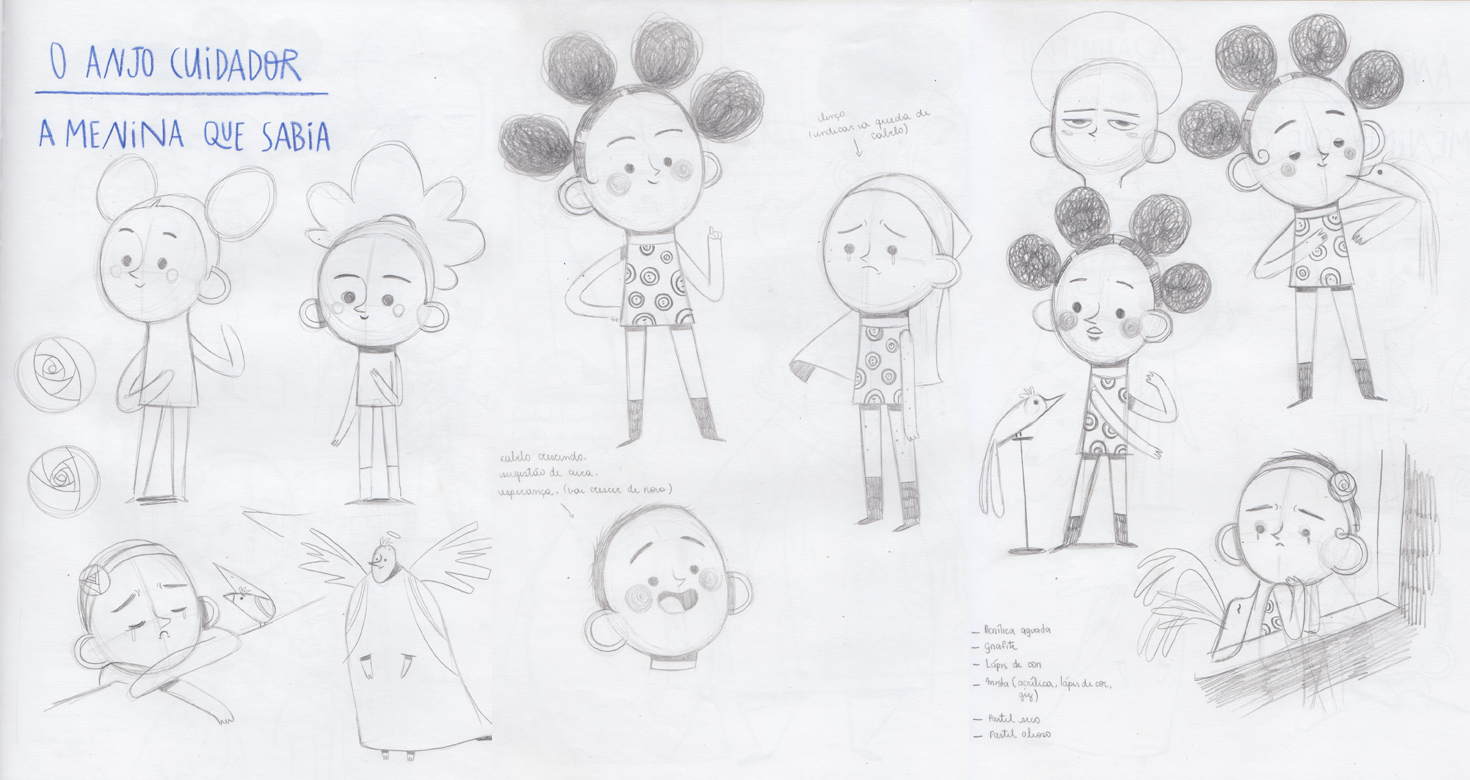
Early character sketches – The Girl
Characters: The Caring Angel and The Bird
One of the biggest questions I faced was how to represent the angel. In my imagination, the stereotypical image of an angel is that of a white male figure with blonde curly hair and feathered wings — a Western, Catholic-inspired ideal drawn from Renaissance imagery. But this didn’t feel right for the story. More importantly, I wanted a figure that could transcend religion, ethnicity, and gender — something more universal.
After much reflection, I kept certain recognizable angelic traits: a humanoid figure, wings, and a halo. But I designed an ethereal, minimalist being, neutral and fluid, whose presence could evoke grandeur, peace, and something greater than ourselves.
Another challenge was how to include the angel in the girl's story, where he is never physically present but deeply felt. My solution was to represent him as a bird. This bird appears in every illustration on her side of the book, always near the girl. Visually, the bird shares certain traits with the angel from the other story, creating a subtle symbolic bridge between the two characters. At first, the reader might not understand what the bird represents. But by the end of both stories, attentive readers will connect the dots: the bird and the angel are the same entity — the physical and spiritual manifestations of faith.
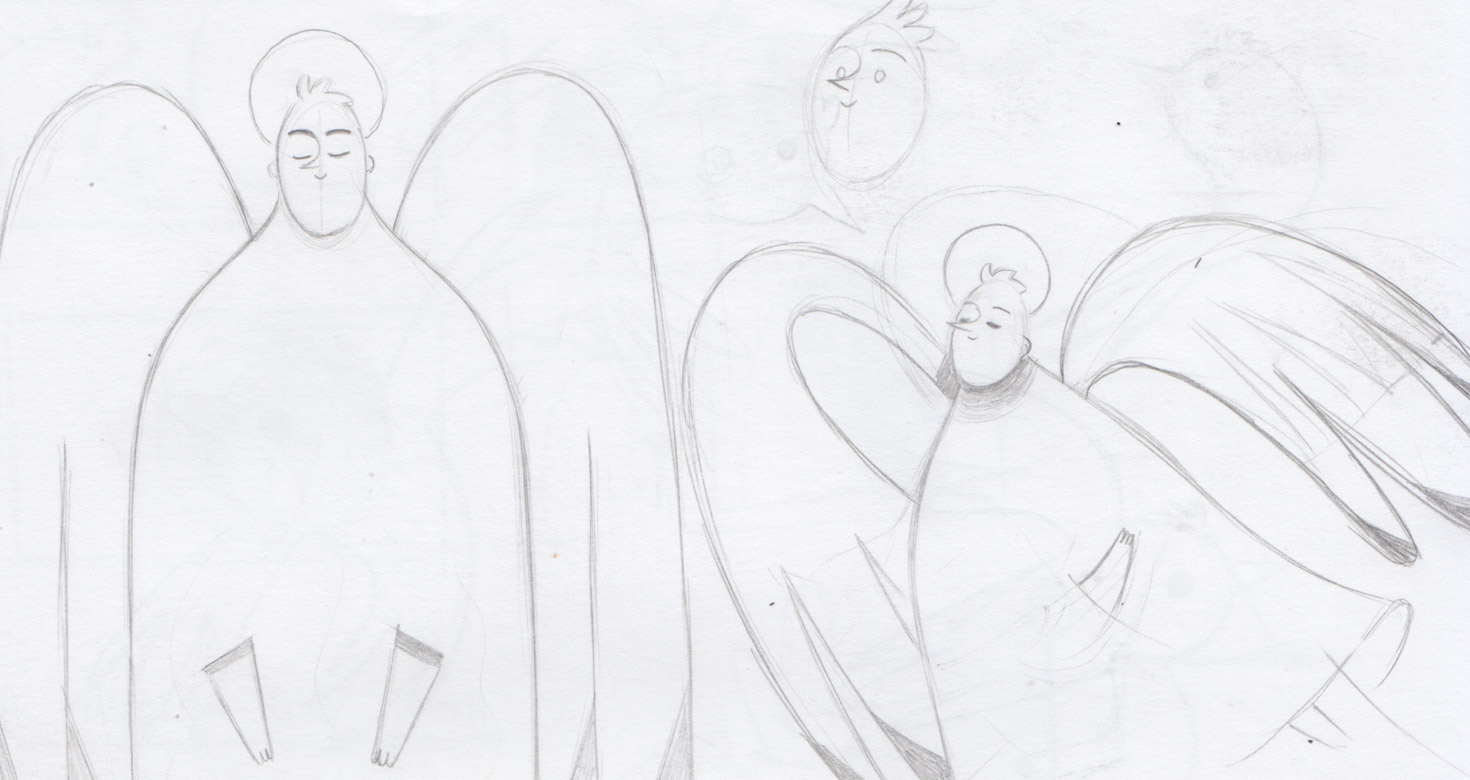
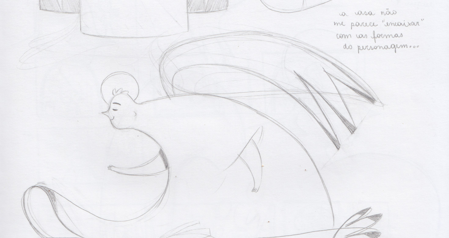
Early character sketches – The Caring Angel
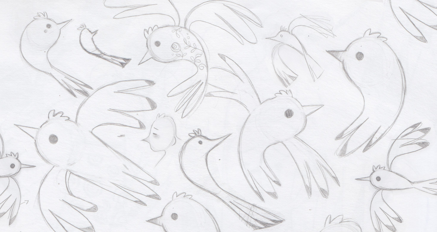
Early character sketches – The Bird
The Color Pallete
One of the most striking decisions in this book was the use of color. Colors are powerful tools for evoking emotions and guiding a reader’s interpretation.
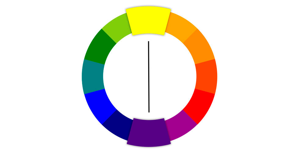
Because this book is about faith and hope — and about something divine, compassionate, and wise — I chose to work with a limited, symbolic palette: yellow and purple. These two are complementary colors on the color wheel — positioned opposite each other and, when used together, they create balance and harmony.
Available at: The Shelby Studio. https://www.theshelbystudio.com/the-blog/color-coordinating-for-a-family-photo-session (accessed on May 6, 2025).
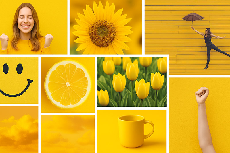
Yellow is associated with positivity, happiness, warmth, energy, and creativity. So I used it predominantly in the girl’s story, with slightly adjusted saturation to better suit the emotional tone. Purple is rich with meaning: from royalty and power to spirituality, mystery, wisdom, and transformation. That’s why it became the central color in the angel’s narrative.

Moodboards exploring the emotions behind the project’s main colors
By using this dual color scheme, I emphasized (through color) the contrasts that shaped the project: human x divine, optimism x wisdom, real x mystical. These dualities form the foundation of the book's concept.
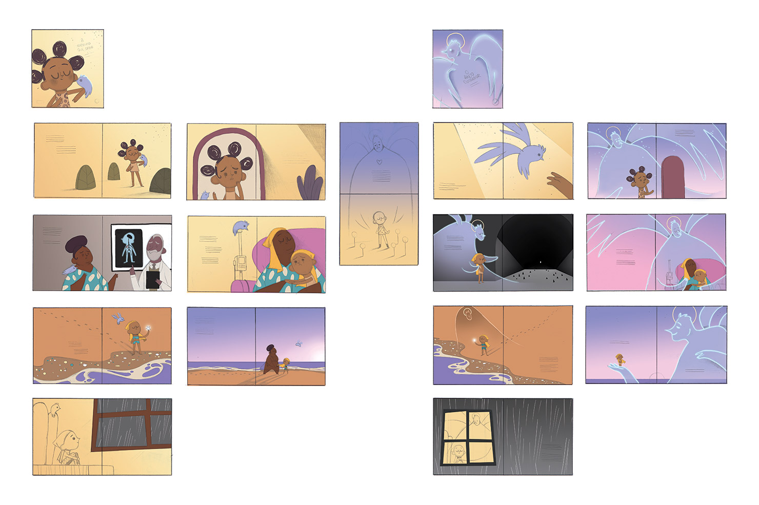
Thumbnails with the full color rough of all the book’s illustrations
Book Overview with Personal Notes
In this section, I’ll walk you through both narratives of the book — side by side — along with some personal notes to help you understand my creative thinking and the layers of meaning behind the illustrations. On the left, we have the girl’s story (The Girl Who Knew); on the right, the Angel’s (The Caring Angel).
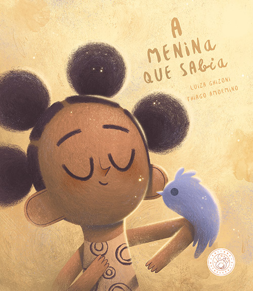
Cover: The Girl Who Knew
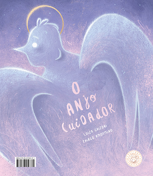
Cover: The Caring Angel
Covers: To convey the emotional depth required for this book, I chose to work with a more dramatic use of light and shadow — and that intention is already evident on the covers. Both characters are rendered with more volume and depth. A key detail lies in the color palette: the girl is placed in a warm, yellow-toned world, while the bird connecting to her reappears on the Angel’s cover, now enveloped in purple — a complementary hue that echoes the book’s central duality.
Spread 1: The Girl Who Knew
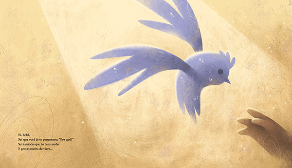
Spread 1: The Caring Angel
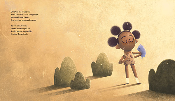
Spread 1: In the girl's storyline, she appears healthy, and the mysterious bird is already by her side. At this stage, readers still don’t understand its meaning. On the Angel’s pages, the bird is now center stage, either flying toward or landing on an open hand. A beam of light from above guides the scene — possibly divine — while the hand stretches out, as if asking for help or offering a place to rest. The yellow background remains, indicating we are still in the material realm.
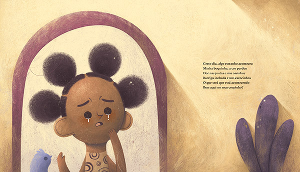
Spread 2: The Girl Who Knew

Spread 2: The Caring Angel
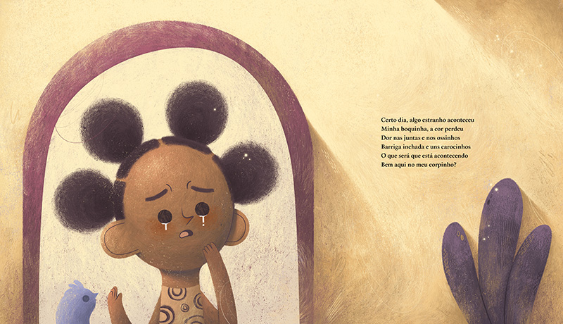
Spread 2: This is when symptoms begin to appear. In the girl's perspective, her expression in the mirror shows sadness and concern. The bird remains present. On the Angel’s side, we see the same moment from a different angle. The Angel makes its first visual appearance: delicate and majestic, built with minimal lines and glowing with a divine aura. Purple now dominates, signaling a shift toward the spiritual realm.
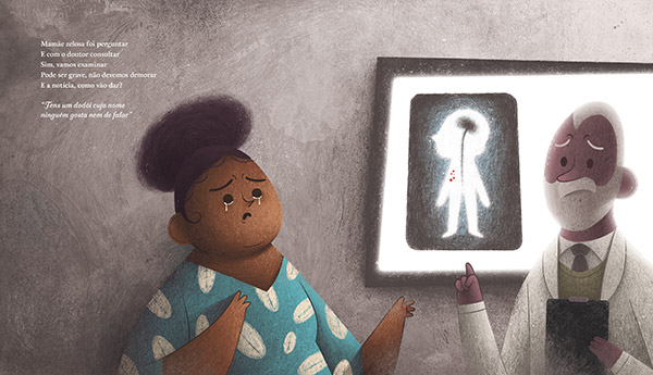
Spread 3: The Girl Who Knew
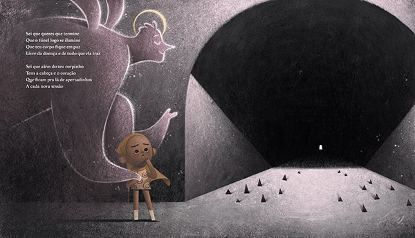
Spread 3: The Caring Angel
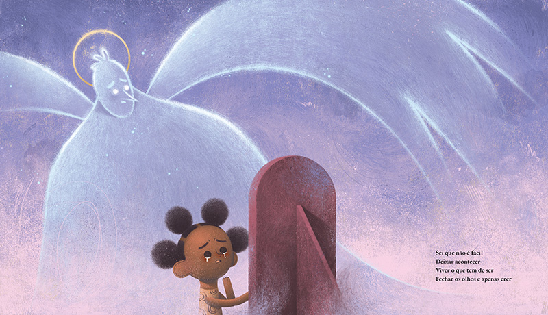
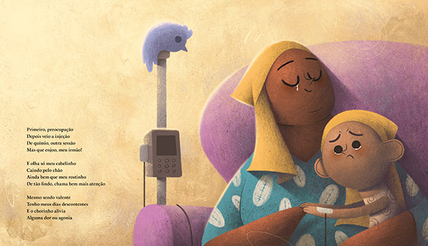
Spread 3: This is the moment of diagnosis. On the girl's pages, I portrayed the doctor sharing the news with her mother. The tones darken — greys and blacks take over — emphasizing the emotional weight. On the Angel’s side, I maintained that visual tension. The child faces a tunnel, symbolic of uncertainty. Thorns line the path, hinting at the pain ahead. But far in the distance, a light glows. The girl’s expression reflects sorrow; the Angel’s, calm and knowing — as if trusting in the presence of that distant light.
Spread 4: The Girl Who Knew
Spread 4: The Caring Angel
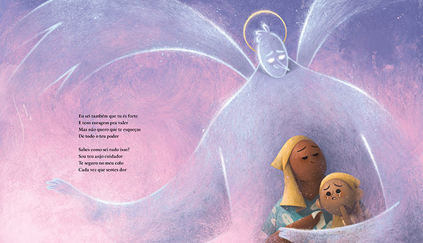
Spread 4: Both scenes depict a moment during chemotherapy. On the girl's pages, she’s visibly upset, now wearing a scarf on her head — a subtle way to reference hair loss without being visually aggressive. Her mother is beside her with a supportive, yet emotional gaze. The bird continues to accompany the girl, becoming increasingly familiar to the reader. On the Angel’s pages, we see the same setting from a wider viewpoint, where the Angel gently embraces both characters. Their gazes are full of compassion.
Spread 5: The Girl Who Knew
Spread 5: The Caring Angel
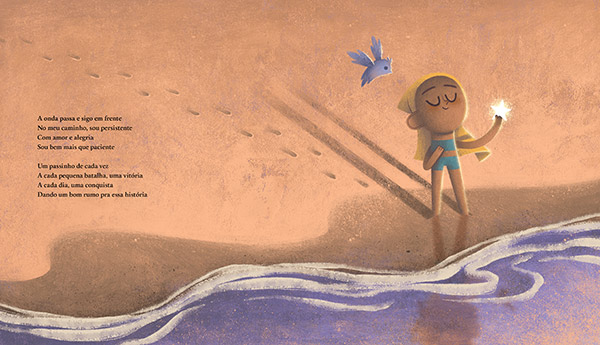
Spread 5: Here, I introduce metaphors using the beach and footprints. On the girl's side, each step in the sand represents her slow, steady progress. The waves echo life’s cyclical nature — constantly arriving and retreating, sometimes calm, sometimes overwhelming. The starfish she holds symbolizes her connection to nature, and her intuitive grasp of the greater rhythms around her.
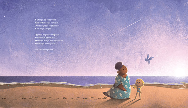
Spread 6: The Girl Who Knew
Spread 6: The Caring Angel
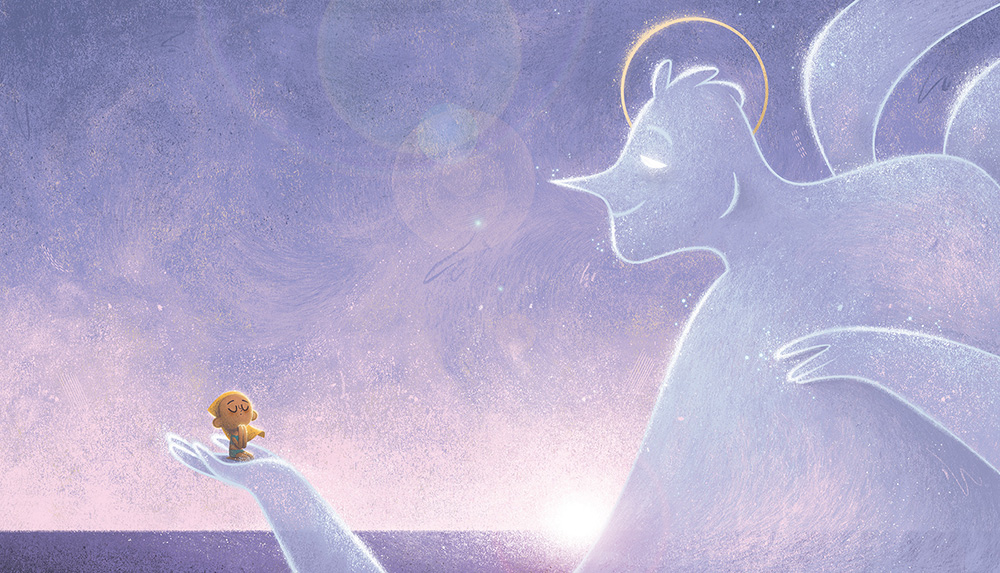
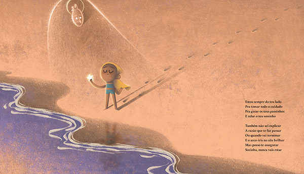
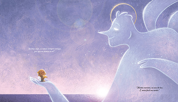
Spread 6: Still by the ocean, the girl walks with her mother and the bird. All are moving forward. The footprints continue, reinforcing the sense of perseverance. The purple tones dominate now — the natural setting itself taking on a divine quality. On the Angel’s pages, we see one of my favorite illustrations: the girl prays while being cradled in the Angel’s enormous hand. This scale contrast emphasizes the protective and transcendent nature of faith. She is, quite literally, “in good hands.”
Spread 7: The Girl Who Knew

Spread 7: The Caring Angel
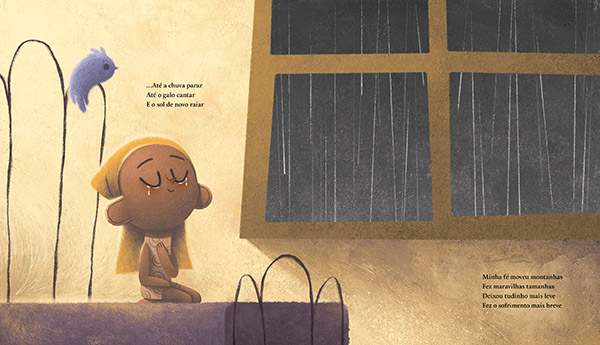
Spread 7: Just before the two narratives meet, I use rain as a visual metaphor for hardship. It pours, it passes. It cleanses. A symbol of both pain and renewal — it marks the end of a difficult cycle, and the hope of a brighter chapter. Outside, the night is dark and stormy — but inside, there is warmth, light, and a quiet sense of hope.
Center Spread
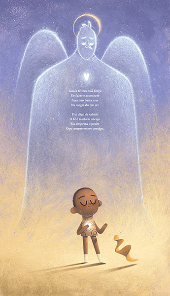
Center Spread: This is the heart of the book — where both stories converge and conclude. On the Angel’s pages, purple dominates. On the girl's pages, yellow is prevalent. In the middle, they blend into a gradient: two worlds merging into one. The girl no longer wears her scarf. Her short hair suggests recovery. A glowing hand rests over her heart — and the Angel mirrors this gesture. Two glowing hearts, aligned. A subtle but powerful message that what binds them isn’t physical — it’s something greater, something that cannot be seen, only felt.
It’s a moment that transcends words. A poetic, emotional closure that leaves the reader with a sense of beauty, healing, and connection to something far beyond the pages.
Overview of the book with final illustrations
Final Reflections
Working on The Girl Who Knew was one of the most emotionally profound experiences of my career. While all the books in the Virtues Collection challenged me in different ways, this one, with its sensitive theme and spiritual undertones, touched something very deep inside me.
Throughout the creative process, I wasn’t just thinking about layout, characters, or colors. I was thinking about real people — children, families, caregivers — who live these stories every day. I thought about how illustration can be a form of care, how art can gently hold someone’s pain and transform it into light, into hope.
I also thought a lot about faith. Not necessarily in a religious sense, but as this invisible thread that helps us keep going — even when the path ahead is unclear. I tried to represent that through every choice I made, from the colors to the silhouettes, from the bird to the Angel.
Even now, long after the book was released, I still revisit it from time to time. It’s one of those projects that continues to speak to me — and comfort me — as both an artist and a human being.
If you’ve made it this far into the journey, thank you for walking alongside me. I hope this story — and these illustrations — have touched you in some way, just as they touched me while creating them.
With love,
Thiago

Instagram ♥️ © Thiago Amormino 2026