
Behind the Art:
Creating 'And Now, Dora?'
Editora Matrescência, 2024
And Now, Dora? is a book written by Jessica Marzo, edited and published by Editora Matrescência in 2024. Working with this publisher is always a real pleasure: we have been long-time partners and have collaborated on numerous projects together, reflecting a relationship built on mutual trust and reaffirming my commitment to delivering quality in everything I do.
This particular project captivated me from the very beginning. Jessica's story carries delicate and thought-provoking nuances, allowing for multiple interpretations by the reader. It was an incredibly rewarding process, as I was able to dive deep into the heart of the narrative and, as both illustrator and designer, find the best visual path to bring to life everything we wanted to express.
At the same time, precisely because the story invites so many possible readings, it also challenged me to think differently, and that, in the end, was an incredible gift for me as both an artist and a professional.
Theme and narrative approach
And Now, Dora? explores the importance of healthy boundaries in children's lives. In a world that constantly encourages excess, immediacy, and fleeting pleasures, this story emerges as a gentle tool to help children understand that boundaries, when placed with care, are actually expressions of love and protection.
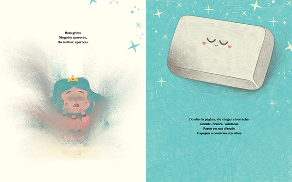
The plot unfolds in a seemingly simple way: Dora is a girl who lives inside a book. At a certain point, she escapes her story and finds herself in a blank page — a place where she can do whatever she wants, with no rules or interruptions. But this space of total freedom soon reveals its downside: with every excess Dora commits (eating too much, playing too much, and so on), the "Great White Eraser" appears and literally erases parts of her body. First her belly, then her feet, then her eyes... until, little by little, Dora begins to disappear — from the book and from her own story.
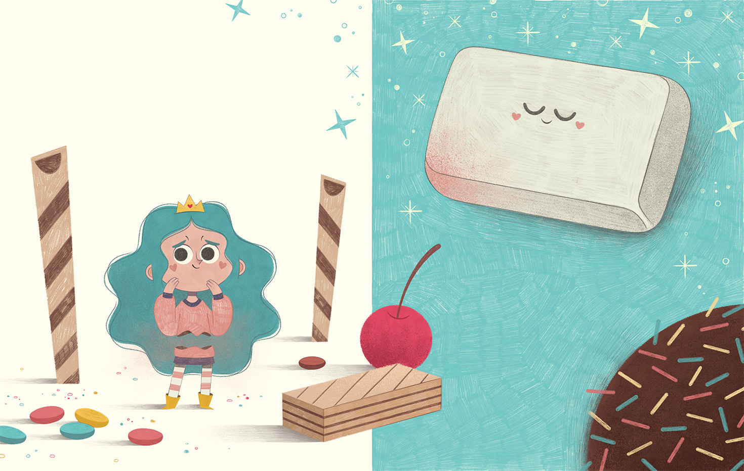
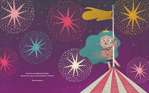
Double-page spread featuring the first appearance of the "Great White Eraser"
In the end, a new figure appears: the Pen. After Dora realizes her need for limits, the Pen gently redraws her body and traces the contours of a new, safe space around her. This visual and narrative metaphor is deeply powerful, especially for young readers, because it speaks directly to their emotional experience of freedom, care, and security.
Initial challenges
As I began reading and rereading the manuscript to prepare for the creative process, countless questions arose: What exactly does the Eraser represent — and the Pen? Should the Eraser be seen as a villain or as a symbol of care? Was there a specific reason behind the body parts that were erased (belly, feet, eyes)?
These questions revealed that the project was far deeper than it initially seemed. I felt the need to talk to Jessica, to the editors, and even to close friends and my therapist, seeking to expand my understanding of the symbolic layers of the story. Themes from psychoanalysis and child development seemed to echo through many aspects of the text.
In the end, we chose to follow a simpler and more accessible visual narrative — after all, the book was meant for children. We didn't want to overcomplicate the experience, but we also didn’t want to strip away the multiple layers of interpretation. We decided to trust the intelligence of the reader, no matter their age, and leave room for each one to find their own answers. And that, truly, is beautiful.
Research and references
One element that became clear to me early on was the strong use of metalinguistic elements in the story. Metalinguistics happens when a work of art speaks about itself — and in this case, we have a character who lives inside a book, escapes into another narrative space, and needs to be redrawn to exist once again. This opened up a wonderful opportunity to play visually with the layers between reality and fiction.
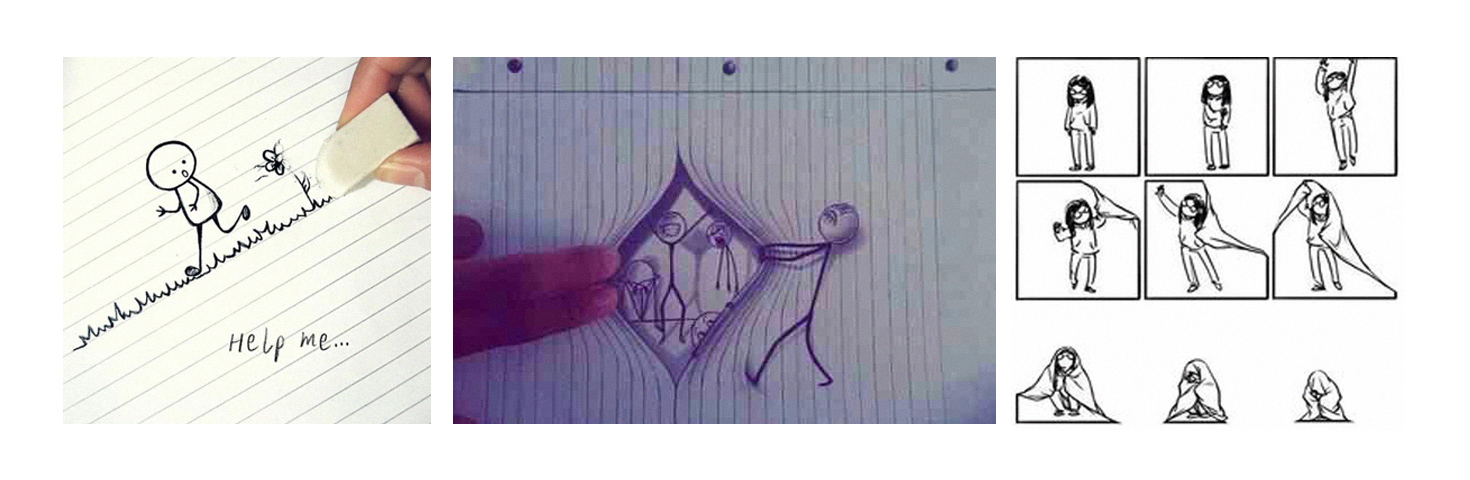
Visual references of metalinguistic concepts. Source: Google Images
My first concept proposal for the book was experimental: in addition to illustrations, I suggested incorporating real photographs — where human hands would interact with the character Dora, reinforcing the idea of the "creator" touching and transforming the "creation."
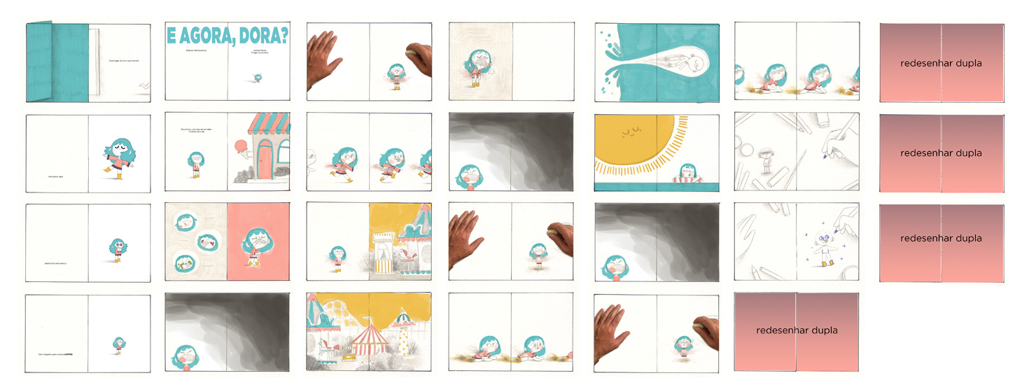
Thumbnails from the first version of the book, combining photographs with illustrations
Despite the poetic potential, we eventually set this idea aside after a few discussions. We felt it would give the book a tone slightly “above” what the story needed, potentially stealing the delicate atmosphere we wanted to preserve. So, I moved on to a new stage of visual studies, focused on finding the right aesthetic for Dora's world.
Creative process and stylistic decisions
In the second round of studies, I initially continued with a more caricatured approach, portraying Dora with exaggerated expressions. However, when we evaluated the overall tone of the book, it became clear that it still wasn’t quite right: we wanted the story to feel sensitive, welcoming, and elegant — not merely fun.
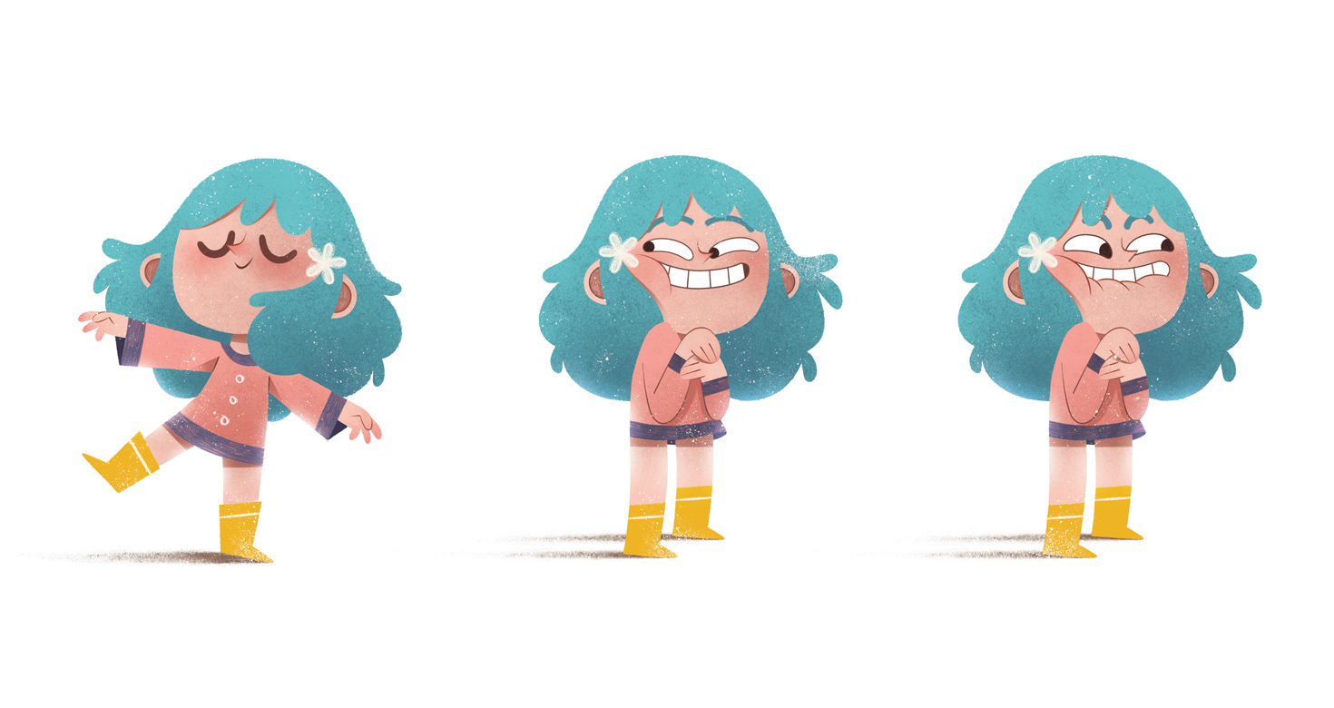
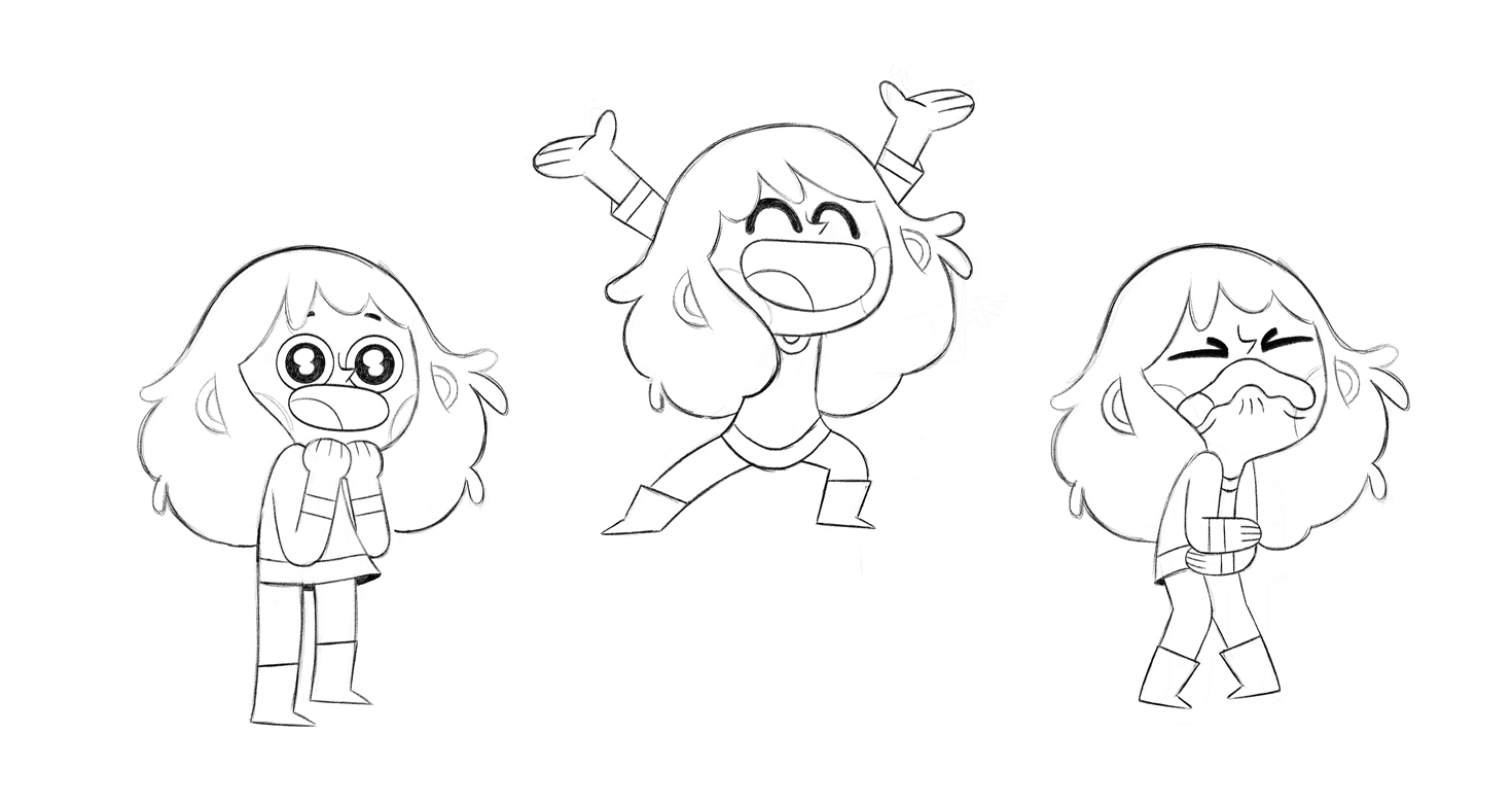
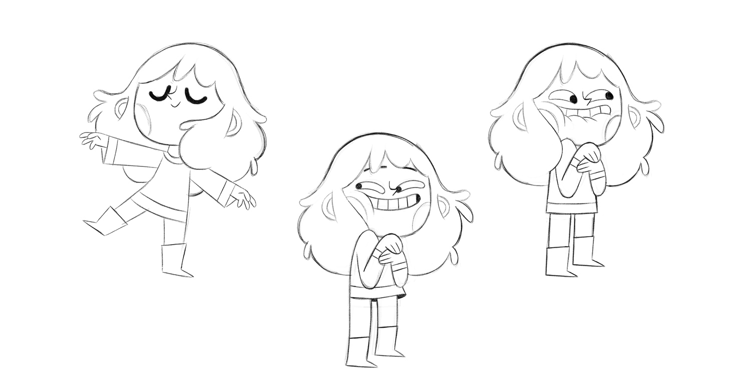
Second design version of Dora
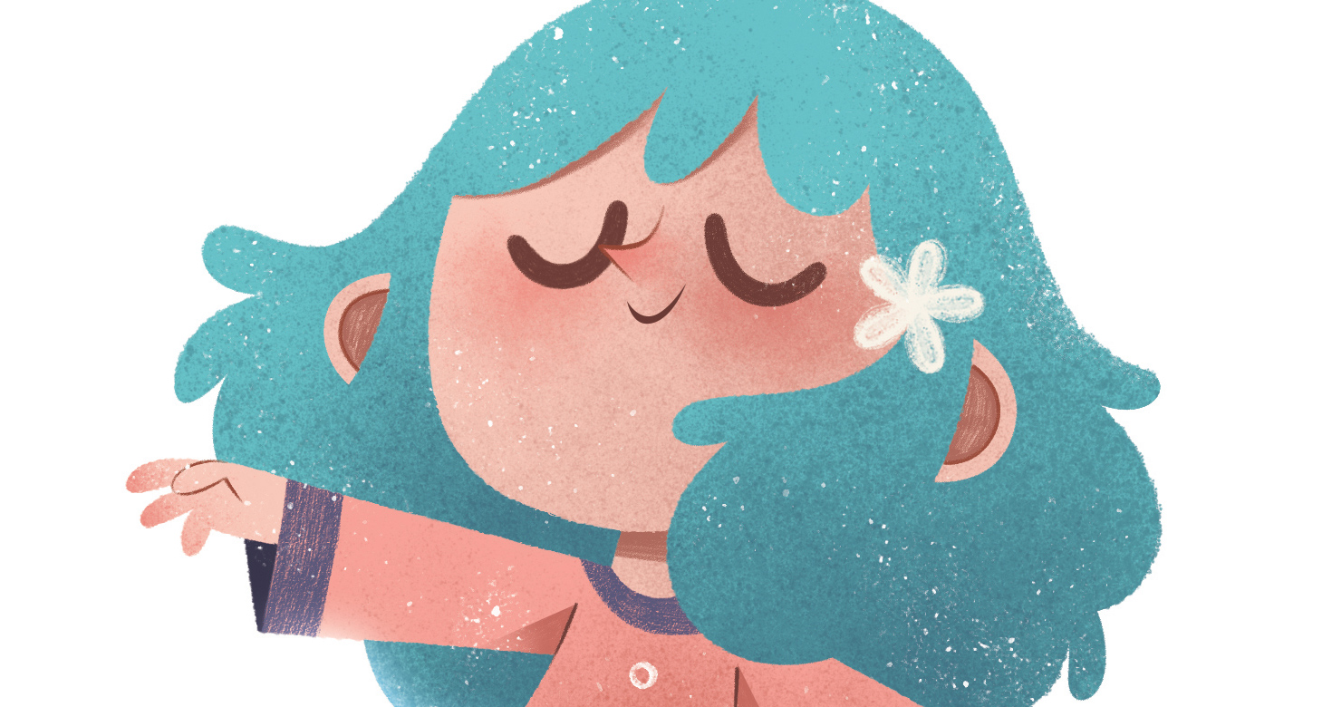
So, I made the decision to redesign Dora from scratch. I set out to create a character who could convey the lightness, poetry, and emotional depth that the narrative truly called for. I also made a subtle adjustment to the character’s painting style — a change that eventually extended to the entire project — as the author wanted the book’s illustrations to carry the feeling of traditional techniques, such as pencil and ink. To achieve this, I revisited my own style, finding a solution that remained visually captivating while incorporating pencil strokes, ink marks, and crayon-like textures.
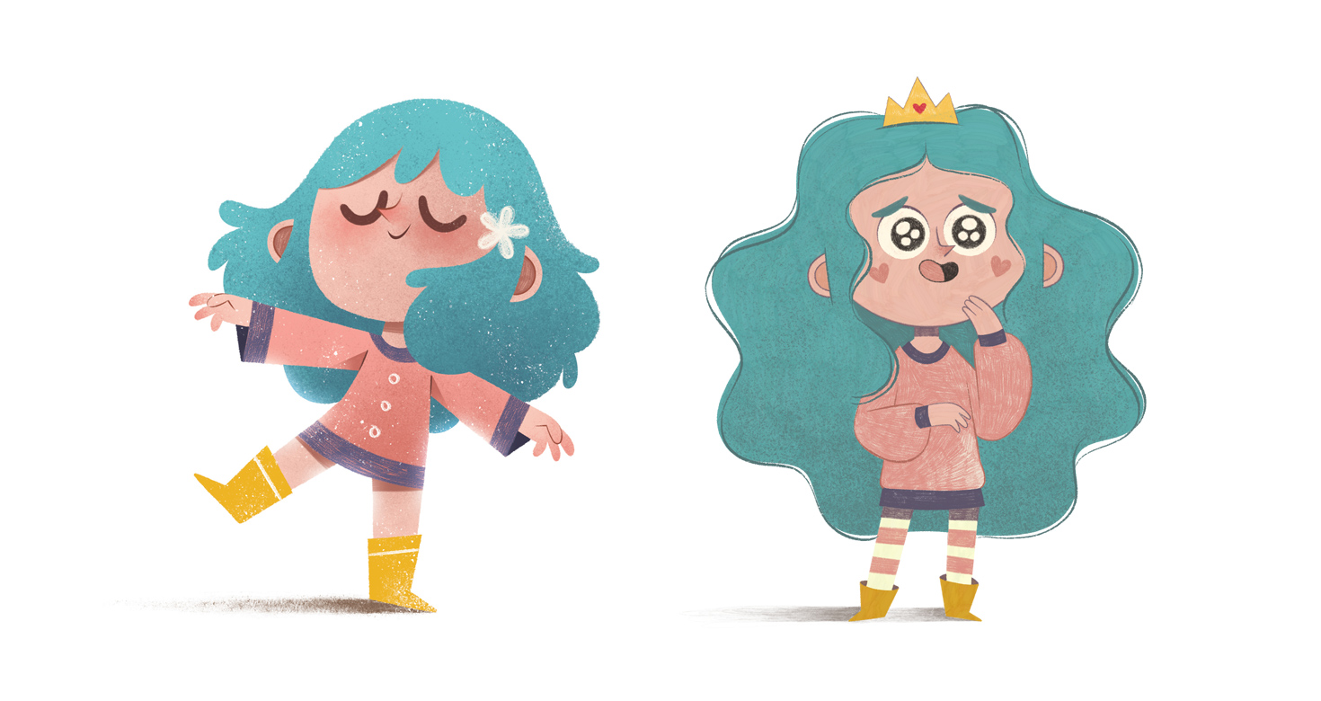
Comparison between previous version and approved version
With the final version of Dora approved, I also revisited most of the book’s layouts, rethinking backgrounds, colors, and framings so that everything would harmonize with this new character design. I was even able to reduce the number of double-page spreads — a decision that not only enhanced the visual narrative but also optimized the production costs of the book, positively impacting the final price for readers.

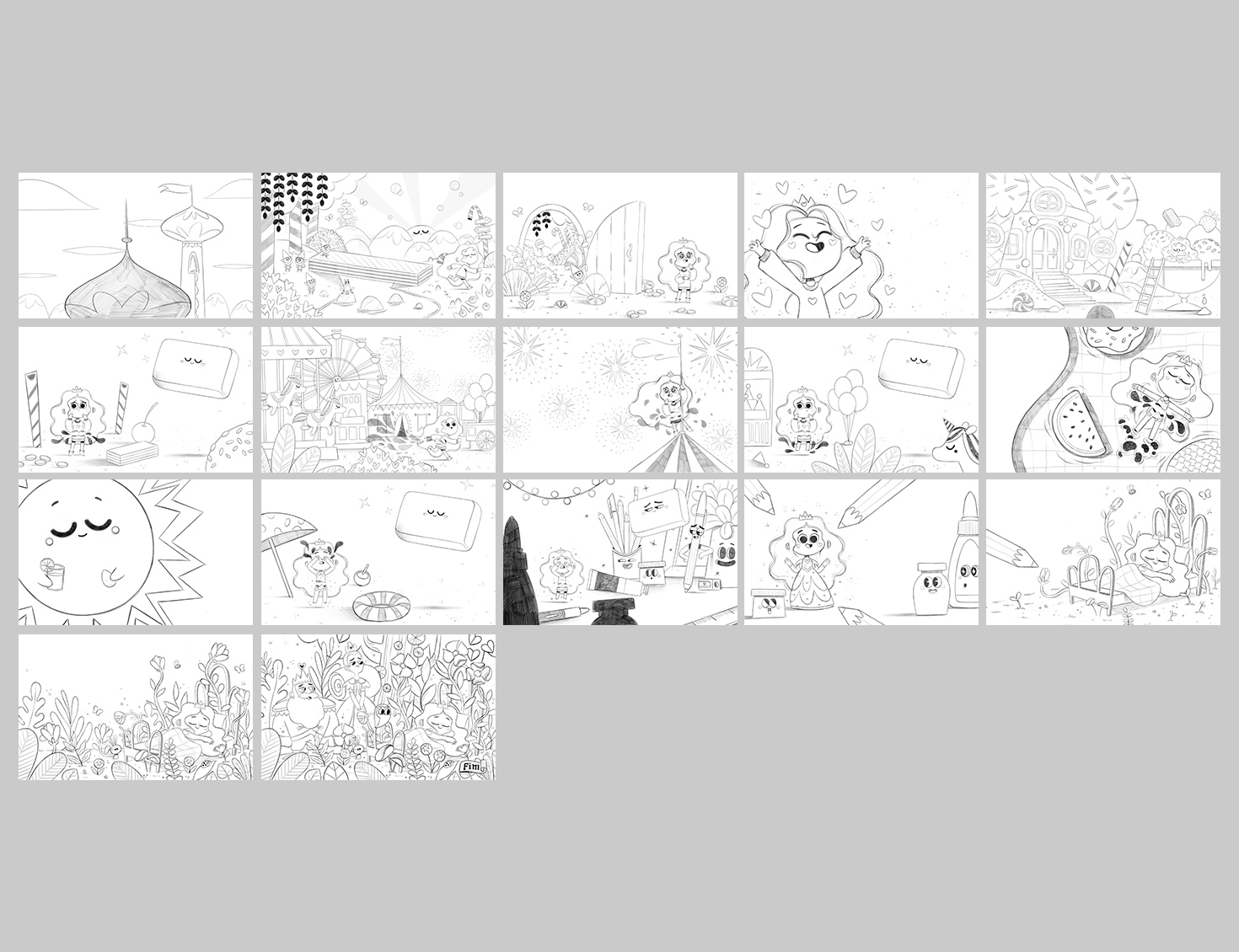
Thumbnails from the second version of the book vs. the approved version
Final result and deliverables
In the final version of the book, Dora is portrayed as a princess who escapes her kingdom — a structured space filled with love and protection — in order to explore the unknown.
Yet what she discovers in this land without boundaries is the fragility that comes from the absence of care. Her return is a rebirth, filled with affection, drawn line by line by the Pen that restores her form, her space, and the love that had always been there.
Book Overview with Personal Notes
In this section, I’ll walk you through each double-page spread, sharing personal notes to help you understand my creative thinking and the layers of meaning behind the illustrations.

1. A silent invitation
1. A silent invitation: The narrative of this project begins even before the reader opens the book or reaches the text. My proposal was for the illustrations to start telling the story first — in a “silent” way — gently preparing the reader for the journey ahead. With that in mind, the cover serves as the first point of contact with the narrative. We see a bright daytime scene, castle towers, and a mischievous-looking character glancing sideways, as if plotting something. "Who is this character? What is she up to?" The cover acts almost like a frozen frame, just about to spring into motion.
2. The sky opens up
3. The first rupture
4. A new world in sight
2. The sky opens up: The book's endpapers extend the sky we saw on the cover, presenting a clean, light-filled space. At this moment, there are no characters or actions yet — it’s a subtle preparation, a quiet breath before the story begins to move. This choice also helps reinforce the time of day: the early morning, full of possibilities.
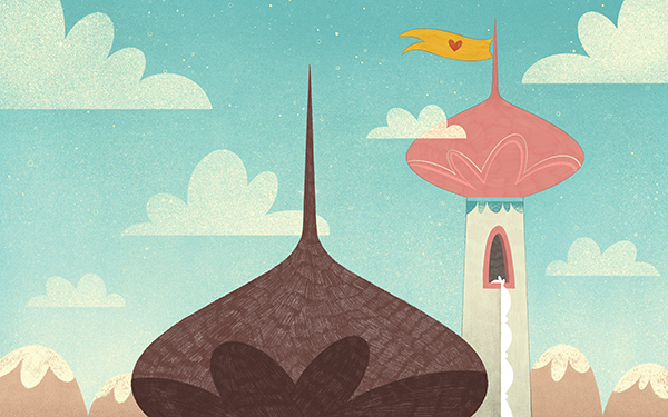
3. The first rupture: The first break from expectation happens right after. Where one would typically find the title page with the book’s technical information, we continue with another wordless illustration: a wider view of the same castle tower seen on the cover. From the tower window, a rope made of tied bedsheets dangles down, suggesting that someone has escaped — most likely the mischievous character from the cover. Here, the reader starts piecing together this visual puzzle, realizing that what seemed like a simple, static image was actually the beginning of an adventure.
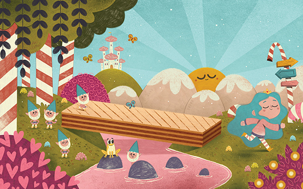
4. A new world in sight: On the following page, we reveal more of this mysterious universe. Dora runs away (heading deeper into the inner pages of the book), entering a new and magical space. Details like direction signs and enchanted creatures suggest that she is not only moving away from the castle — but perhaps also from herself.
5. A leap into the unknown

6. Looking back
7. The question that echoes
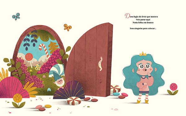
5. A leap into the unknown: Here, the silence is finally broken with the first lines of the text. Dora crosses a doorway and, with a look of wonder, finds herself facing the vastness of a blank page. The central fold of the book clearly divides the “before” and the “after” — emphasizing that she has crossed into something unexpected.
6. Looking back: In this spread, I chose to leave everything blank, highlighting the emptiness where Dora now finds herself. She glances back at the colorful world she left behind. The text completes the earlier sense of mystery: "...boundaries!", revealing what she has left behind.
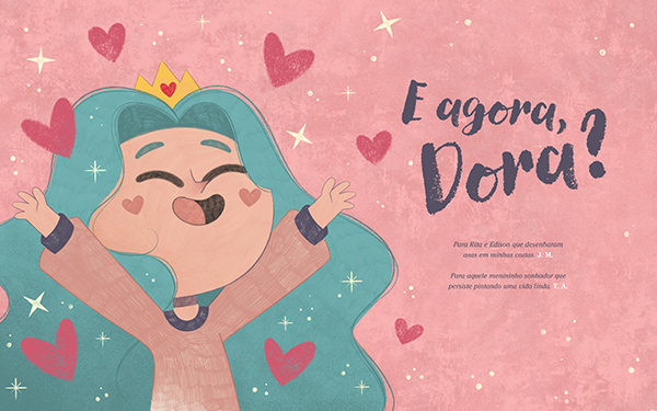
7. The question that echoes: Finally, the book’s title is revealed, as a kind of climax. The illustration shows Dora, now excited, standing before a whole new universe of possibilities. I wanted this moment to feel like in a film, where only after the first major event, the title appears on the screen.
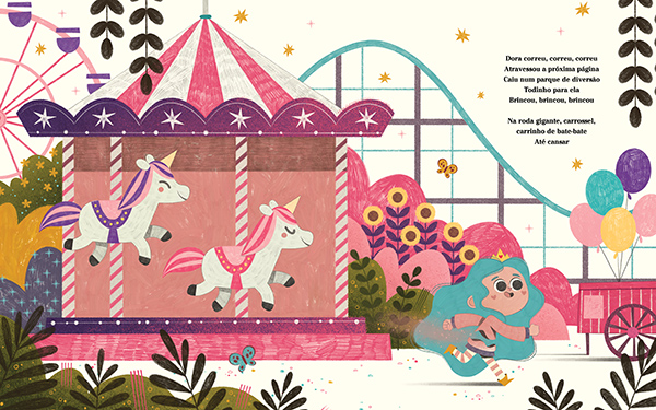
8. A sequence of excesses
9. The arrival of the Great White Eraser
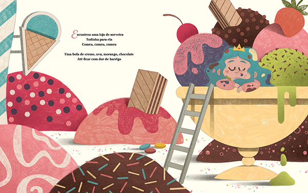
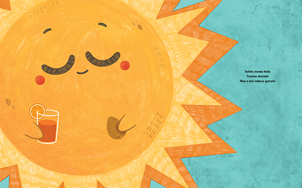
8. A sequence of excesses: From this point on, the visual narrative begins to follow the sequence of Dora’s growing excesses. Her actions escalate — and so does the size of the problem she is creating.
Each impulsive choice takes form in the illustrations: the environment becomes heavier, objects pile up, and the energy overflows. Everything contributes to showing that Dora is gradually losing control — of herself and of the world around her.
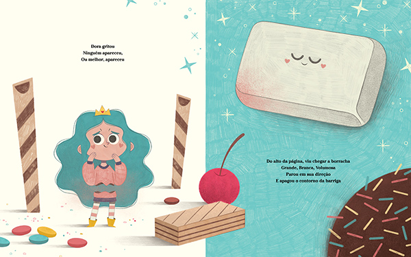
9. The arrival of the Great White Eraser: This is the moment when we meet the Great White Eraser, one of the book’s most striking visual elements. It appears for the first time, erasing Dora’s belly — a visual metaphor for her previous excesses and a boundary placed with affection, not punishment. That’s why its presence is serene and welcoming (with rosy, heart-shaped cheeks to emphasize this idea).
10. Repetition with purpose
11. Repetition with purpose
12. Again and again
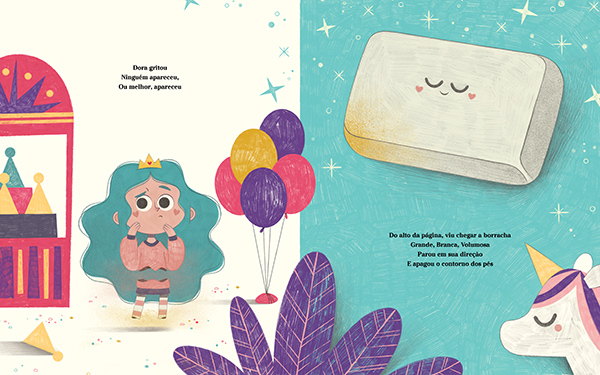
10 and 11. Repetition with purpose: The dynamic repeats itself: Dora goes overboard, the Eraser appears, and another piece of her disappears. I chose to replicate the visual framing, changing only the setting and the erased body part, reinforcing the pattern and rhythm of the narrative.
12. Again and again: The repetition becomes almost like a visual melody — a device to help the reader anticipate what comes next, understand the cycle, and feel closer to the character’s experience.
13. The delicacy of erasure
14. The delicacy of erasure
15. When the gaze is lost
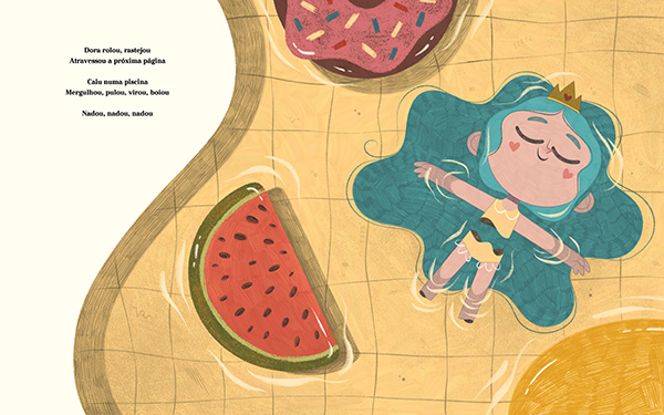
13 and 14. The delicacy of erasure: Representing Dora’s “erasure” visually was one of the project’s greatest challenges. I kept asking myself: “How can I show the absence of part of a body without making it harsh or disturbing?”. I chose to do it literally, but with lightness and harmony. The result can be clearly seen in the water scene, where even incomplete, Dora still floats gracefully.
15. When the gaze is lost: When her eyes are erased, Dora reaches the deepest point of her journey.
She is almost invisible — both to herself and to the world. Emptiness takes center stage, becoming a character of its own.
16. A reunion with colors
17. A new outline
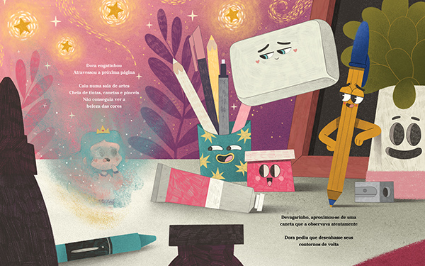
16. A reunion with colors: Almost invisible, Dora arrives in a room filled with art supplies: brushes, paints, pens, and pencils. She can barely see the colors anymore, but even so, she makes a gentle request — she asks the Pen to draw her back. This scene marks a turning point. All the objects, each with affectionate and welcoming expressions, look at Dora with tenderness. The Great White Eraser is there too, serene, watching her with compassion. None of them judge her. They are simply there to welcome her — as if understanding that growing up involves making mistakes, going too far, erasing, and starting again.
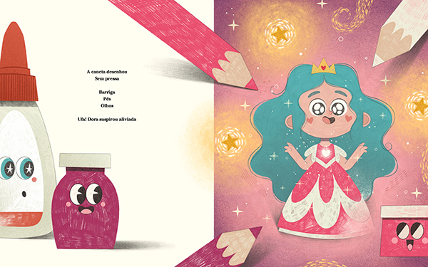
17. A new outline: The Pen and the Pencils redraw Dora. But now, she returns more elegant, wearing a special dress. Her new outfit symbolizes her growth and her new, more mature perspective on herself.
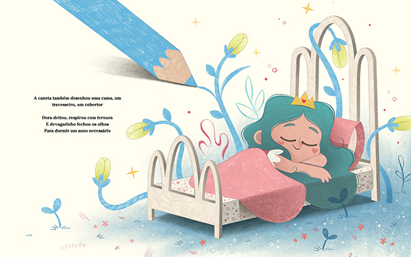
18. The well-deserved rest
19. The well-deserved rest
20. The well-deserved rest
18 to 20. The well-deserved rest: We now reach the final sequence of the book.
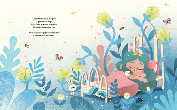
After a day full of emotions, lessons, and discoveries, Dora receives a gentle gift from the Pen: a bed, a pillow, and a blanket, drawn just for her. With tenderness, Dora lies down, takes a deep breath, and slowly closes her eyes, ready for rest. In this scene, boundaries reappear, but now not as restrictions, rather as a form of embrace. The sequence of images unfolds at a soft, magical pace: first, a small garden blossoms around the bed; then it grows, expands, and flourishes, until it fills the entire spread in an enchanting composition.
Dora is protected. Cared for. Cherished. Loved.
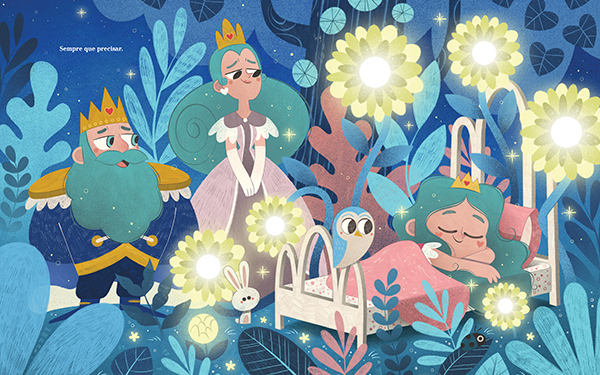
And for the first time in the story, we see the King and Queen standing by her bedside. They watch their daughter sleep with a gaze full of affection and presence. Their eyes, which resemble the shapes of the Eraser’s and the Pen’s eyes, open yet another layer of interpretation: Could these figures represent Dora’s parents? And if so, who would be the Eraser? Who would be the Pen? Why did they manifest in this way throughout the narrative?
As with so much else in this story, these answers are not handed to the reader. They are invitations to reflection — left in the hands of each reader’s sensitivity.
21. A sky full of questions
22. Credits and acknowledgments
23. Credits and acknowledgments
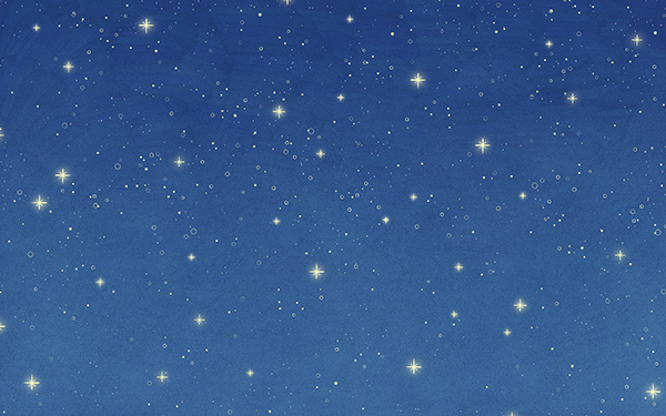
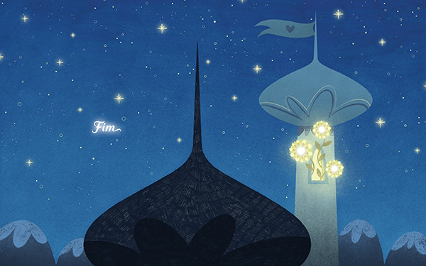
24. From day to night
21. A sky full of questions: We return to the castle tower, now under a starry night sky. And some questions linger over this scene: Did Dora truly run away? Was it a punishment? Or perhaps just a great adventure of imagination?
22 and 23. Credits and acknowledgments: The following pages celebrate all the people who made this book possible, through biographies and heartfelt acknowledgments.

25. From day to night
24 and 25. From day to night: On the final pages — the endpapers and back cover — the night sky reappears, gently echoing the final scenes of the story. At the beginning of the book, we started with a bright blue sky, illuminated by daylight. Now, we close under a starry sky, filled with a sense of closure and completeness. As if the story had indeed traveled a full circle. Because And Now, Dora? is not just a story about excess, boundaries, and imagination. Above all, it is a journey of growth, affection, and reconnection. And like every good journey, it leaves us with something precious before saying goodbye: the feeling that even after we close the book, Dora still lingers — somewhere in the corners of our memory — ready to remind us of the beauty of growing with care and love.
Special thanks
My heartfelt gratitude to Rafaela Carvalho, for believing in my work and supporting me so warmly throughout this journey. To Marina Vereschini, who guided this project with remarkable grace and a kindness that made the process even more special. To Jessica Marzo, for her trust, her creative freedom, and for sharing the coauthorship of this meaningful book with me. And to everyone at Editora Matrescência who, even behind the scenes, played an essential role in bringing And Now, Dora? to life in the most beautiful way possible.
And a very special thank you to you, who made it all the way here and traveled alongside me through this journey into my creative process. I hope you enjoyed discovering a little more about how my mind works!
Thank you, from the bottom of my heart.

Instagram ♥️ © Thiago Amormino 2026